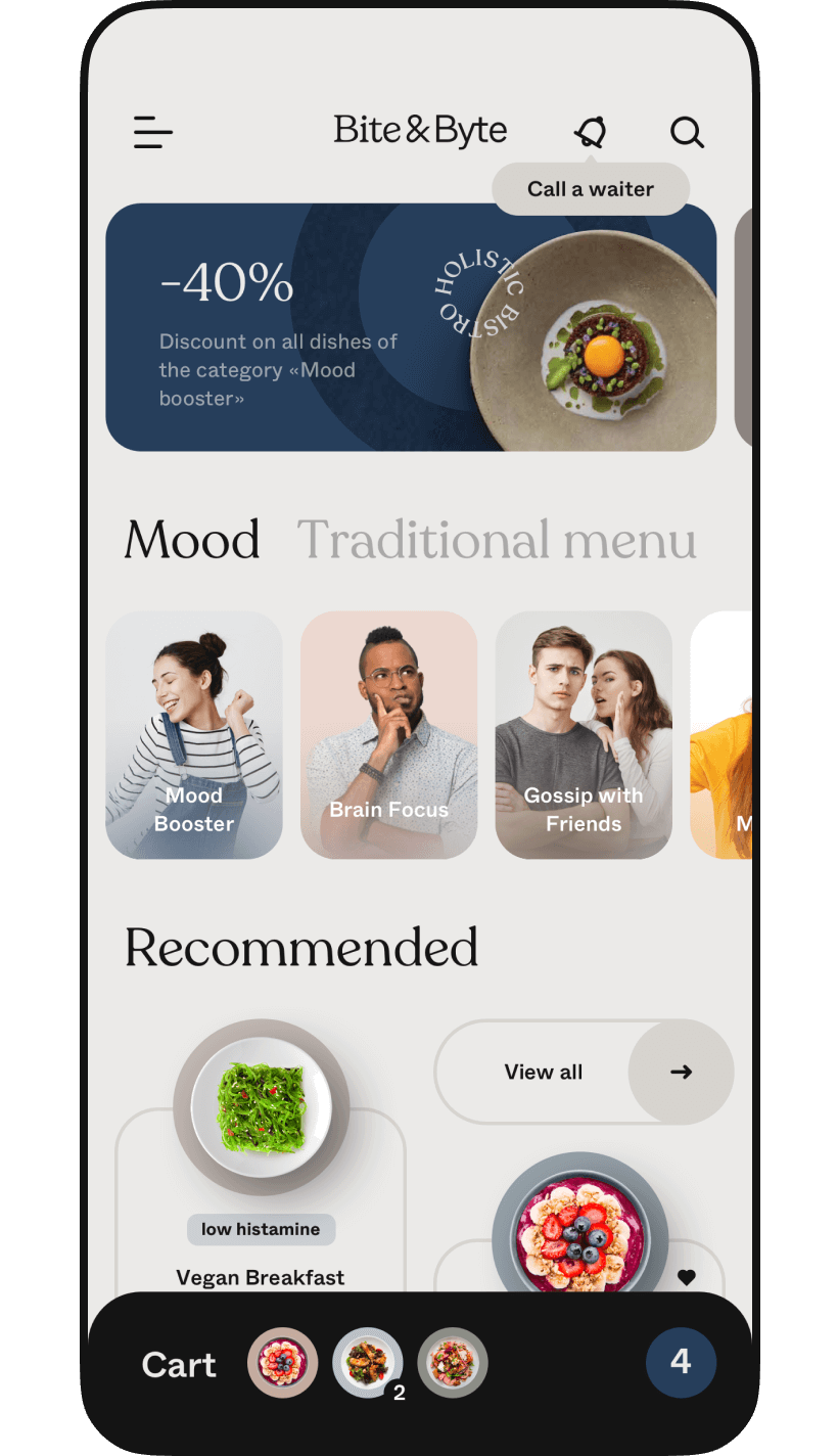
Bite&Byte: Food delivery App.


Tech Stack


Services
Client and idea
Challenge & Goals
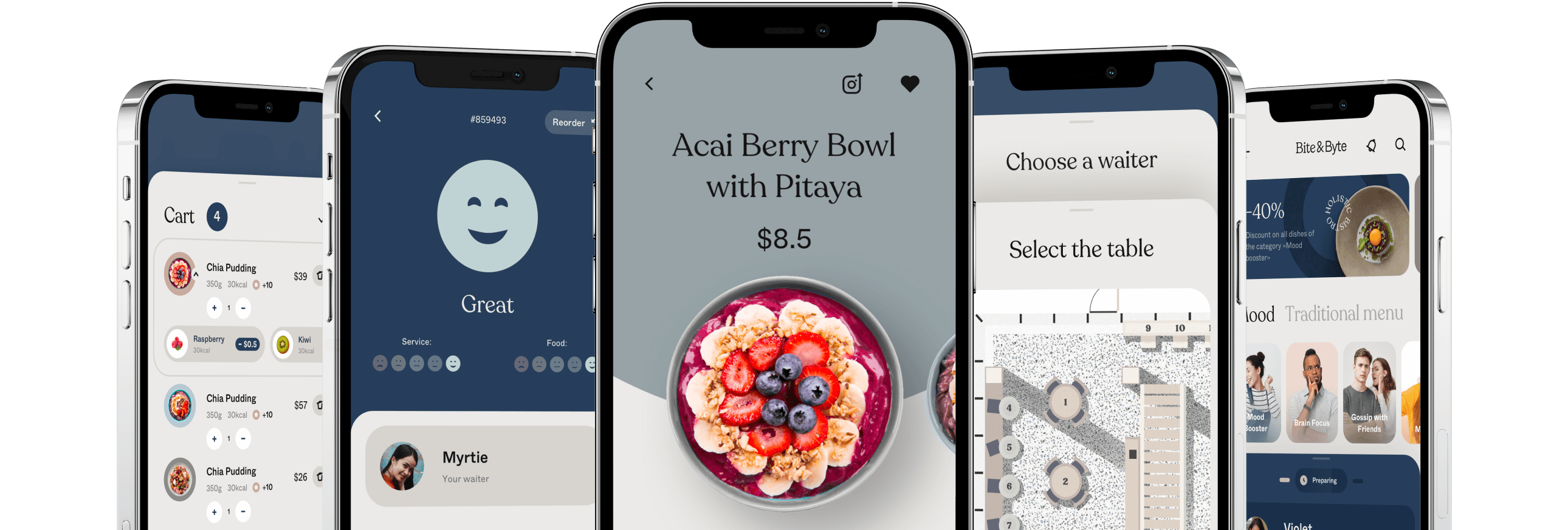
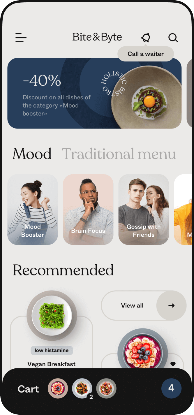
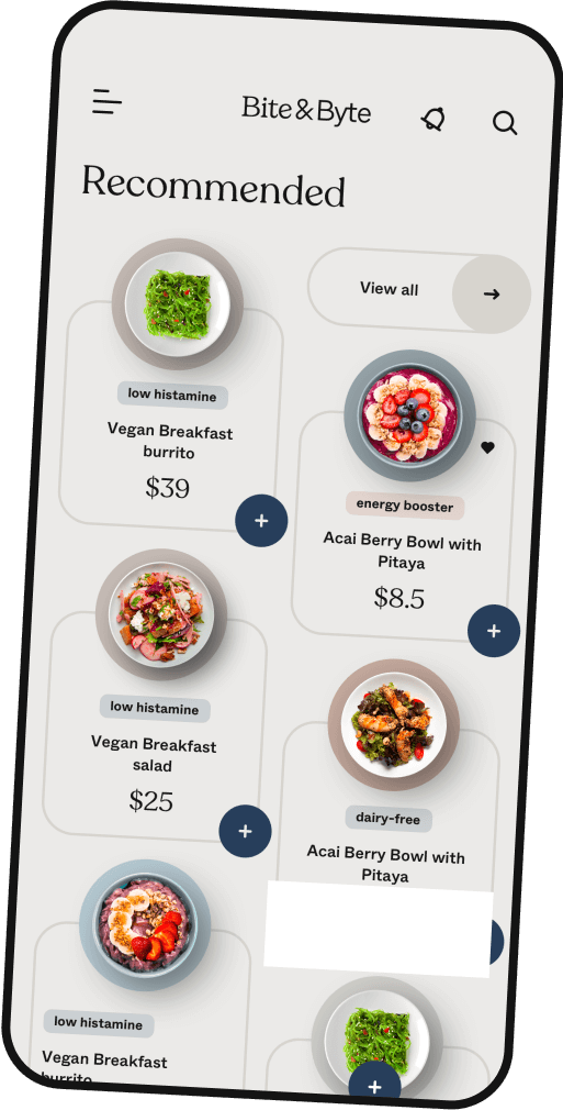
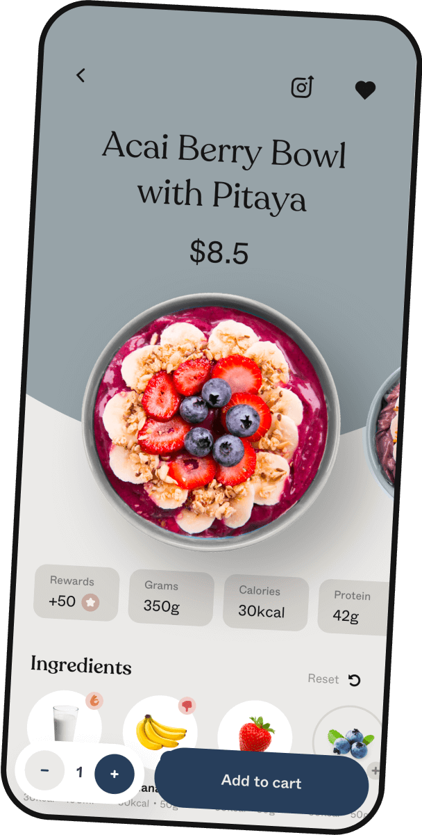
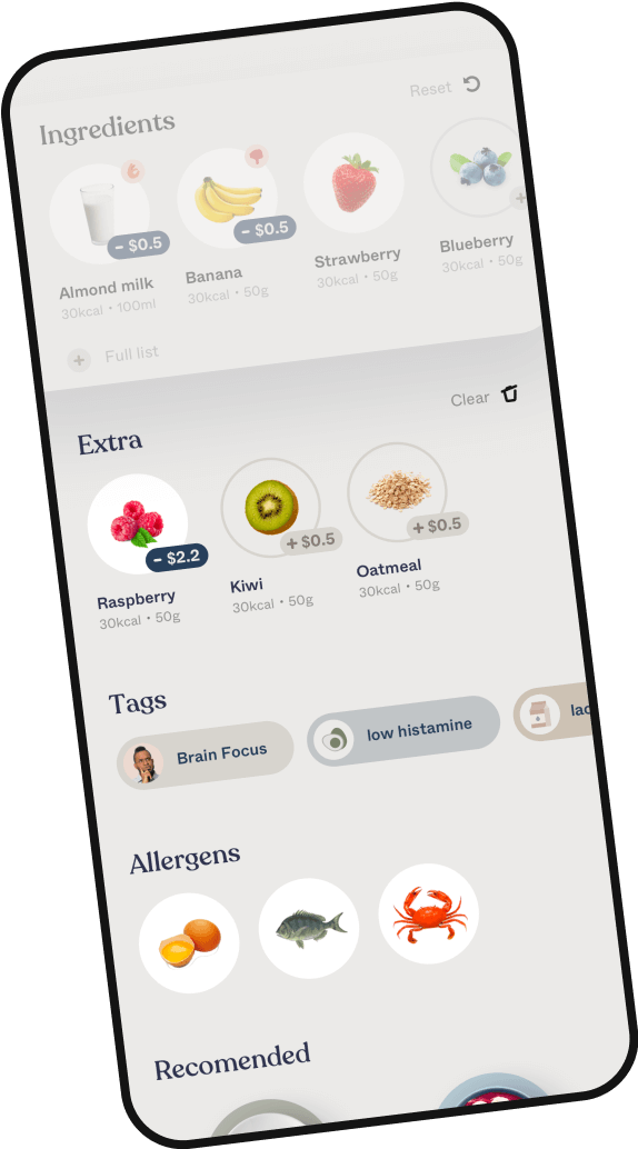
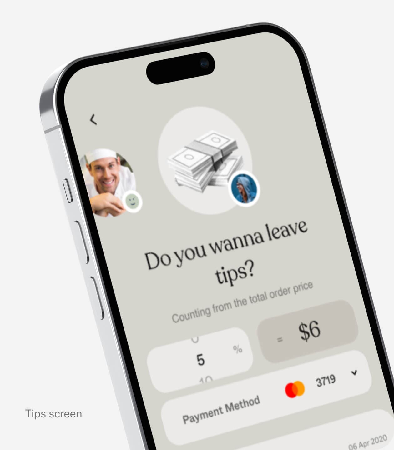
Our goal was to create a new concept for dining-in or placing a to-go order, where people could order fully customizable meals and drinks that match their mood and dietary preferences. The main challenge we took up was to create a visually appealing and intuitive way to incorporate a comprehensive set of menu filters. In addition, it was important to our team to present the customization results clearly, including conveniently displaying the new order total of a customized order.
Solutions & Result
After thoroughly researching successful solutions in the e-commerce and food service industry and familiarizing ourselves with the client's preferences and lifestyle, we carefully crafted the user design that optimized the process of placing a food order and put a new spin on it.


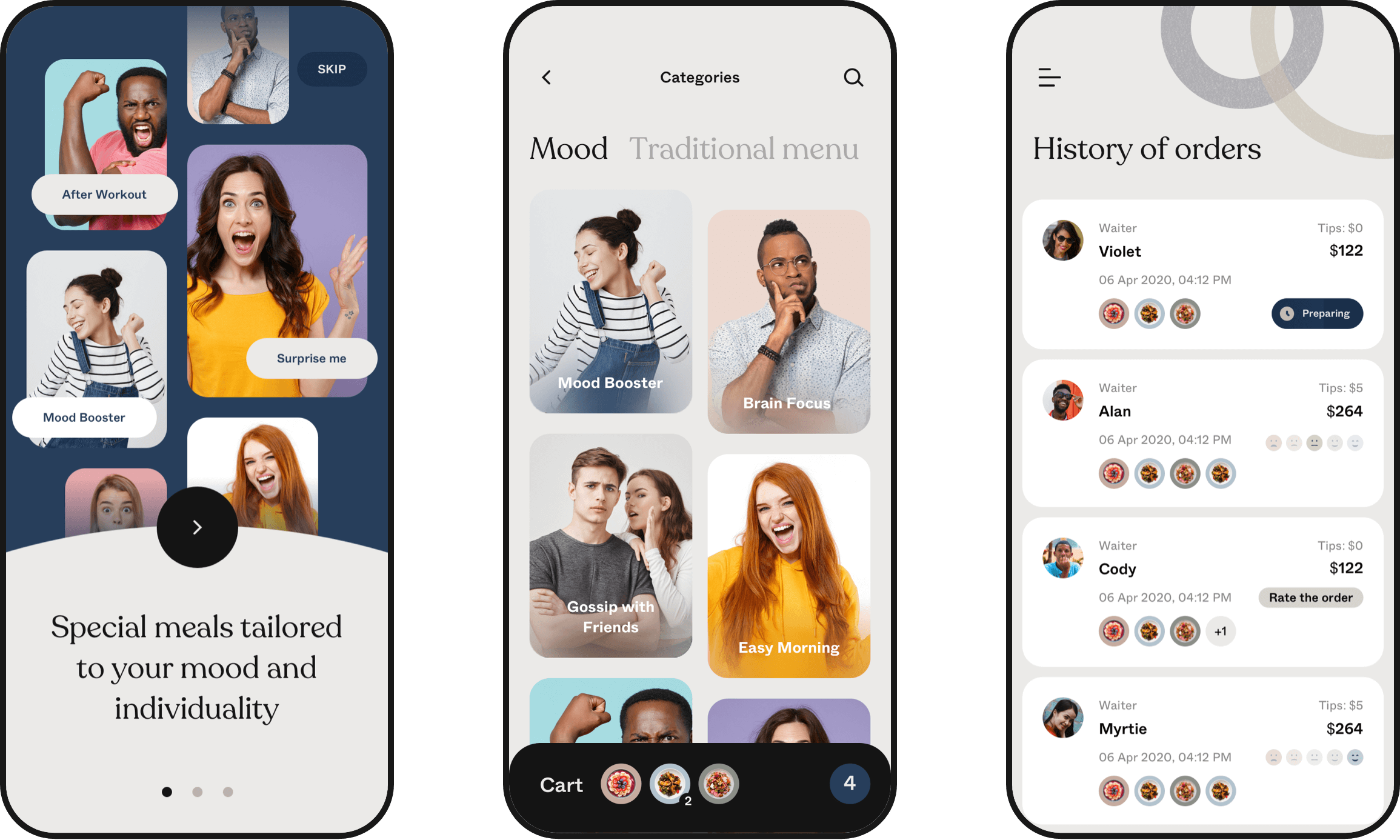
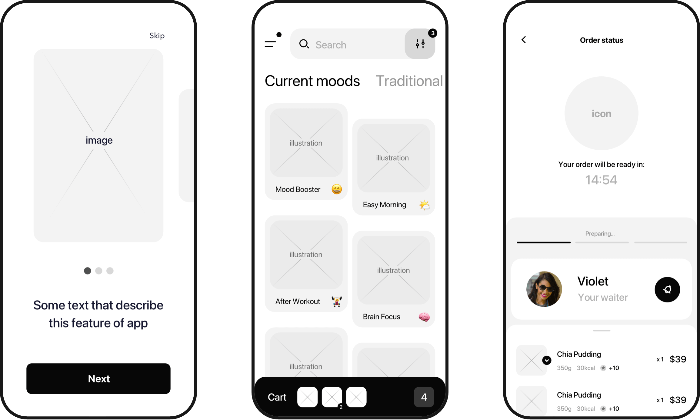
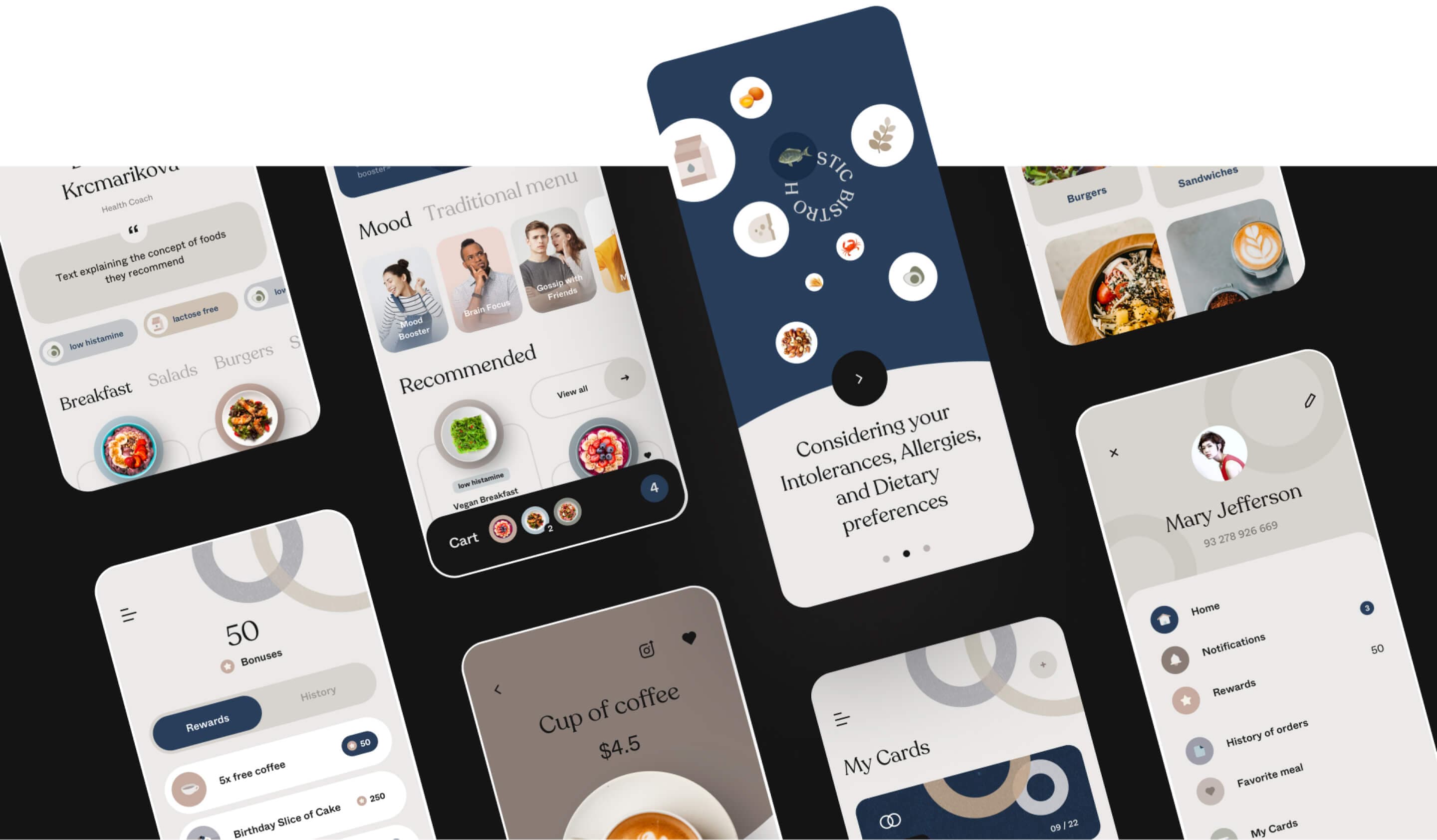
Main app features
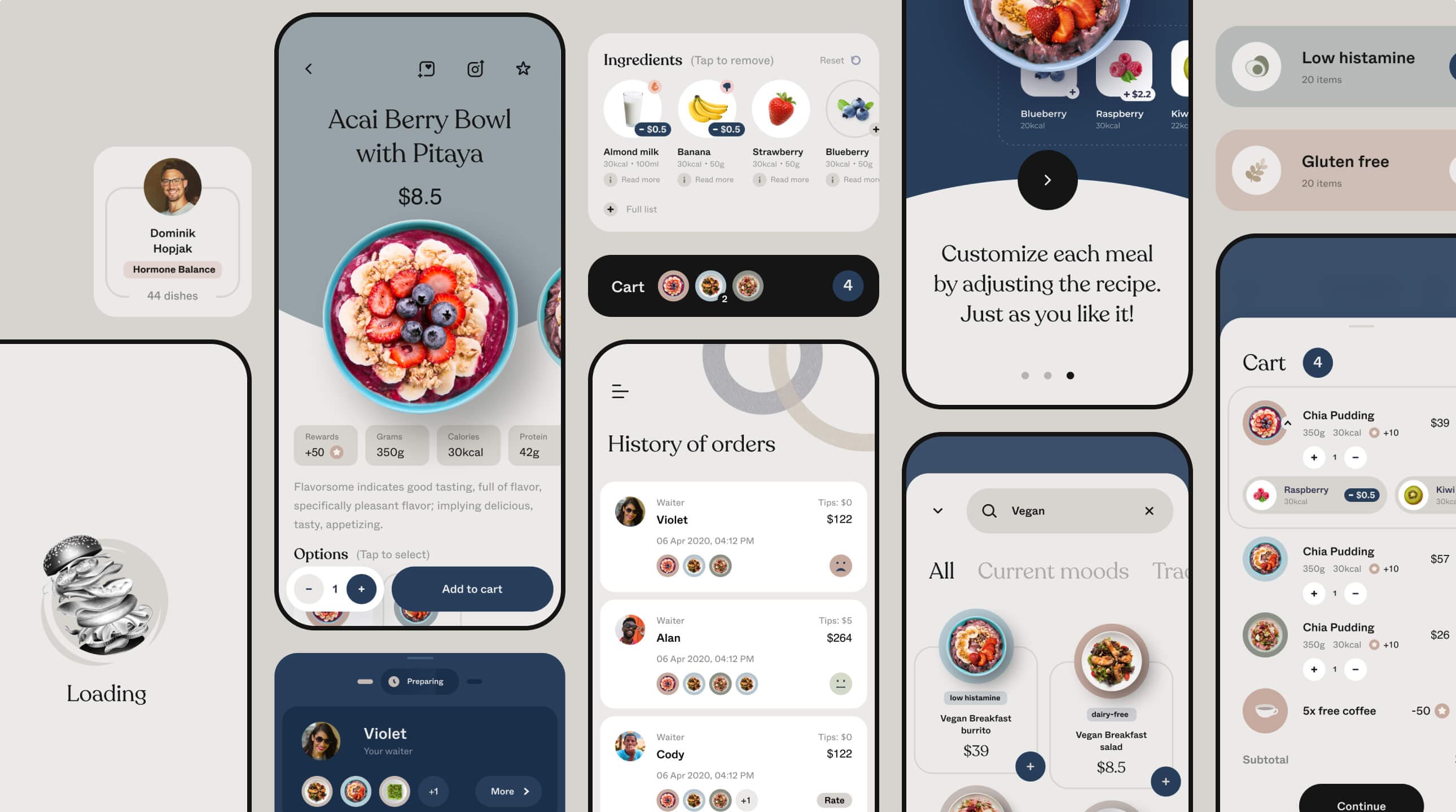
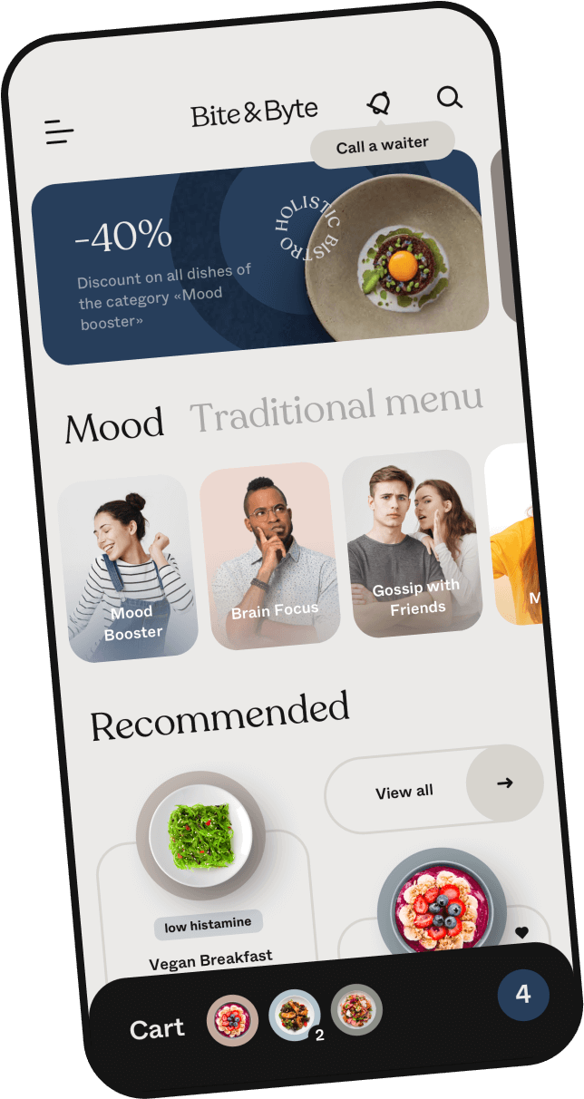
Easy navigate

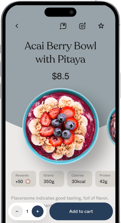
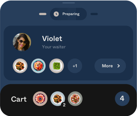
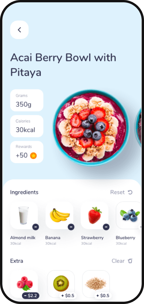
All info you need
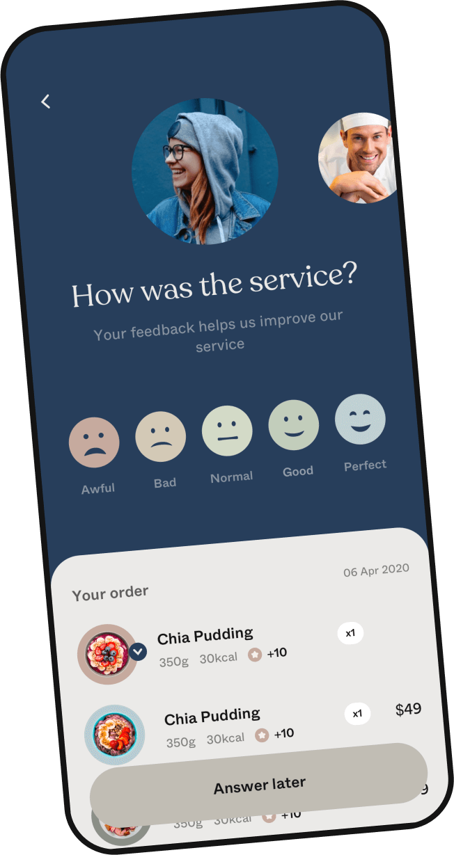
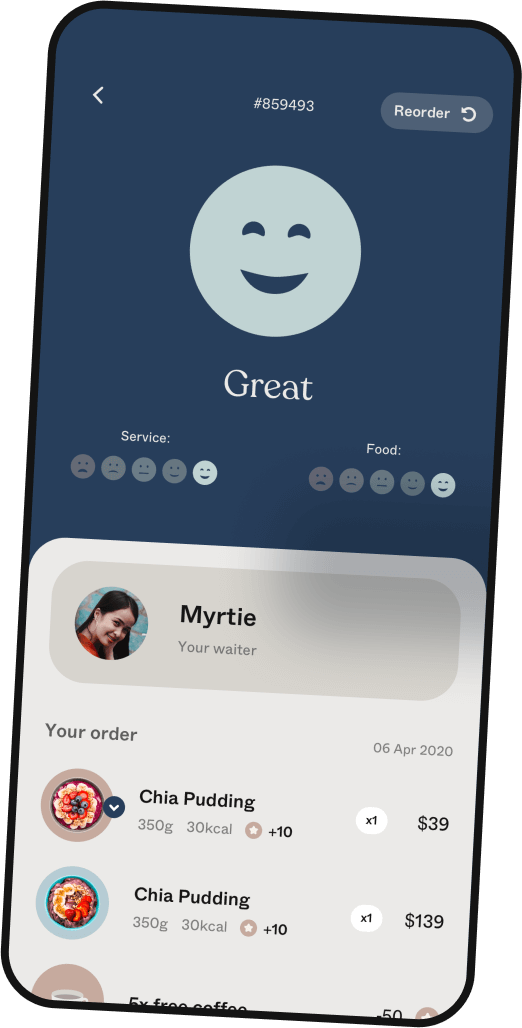
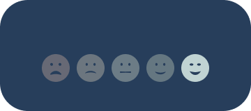
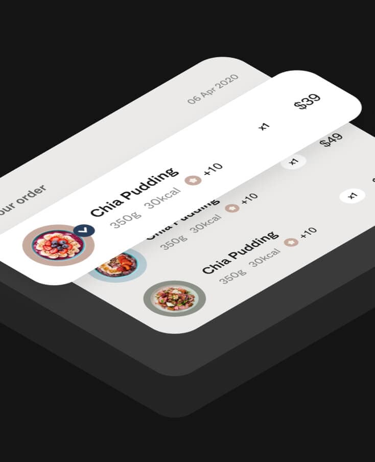
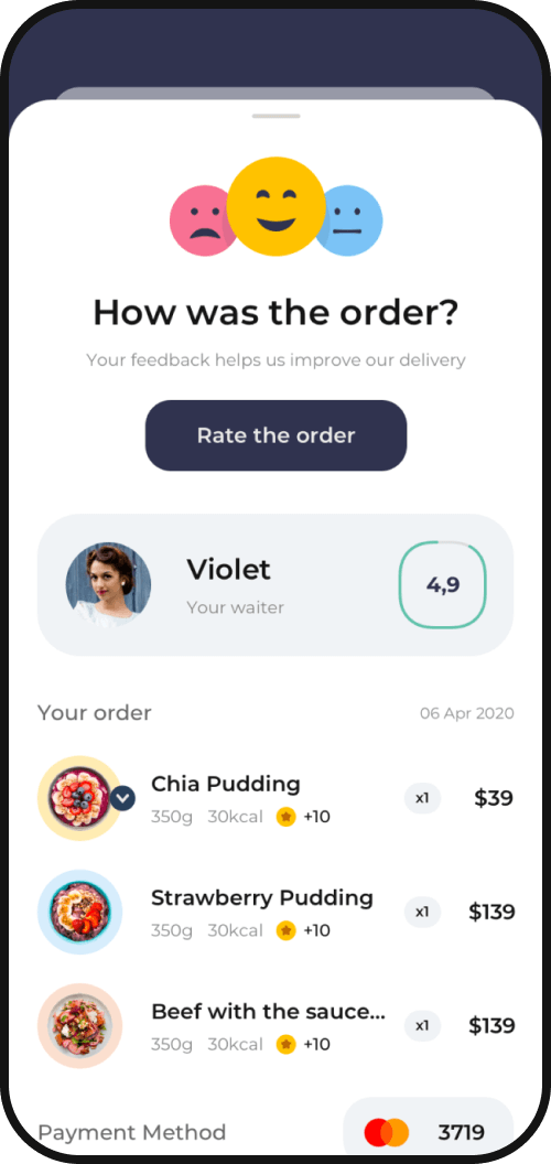
Rate your order
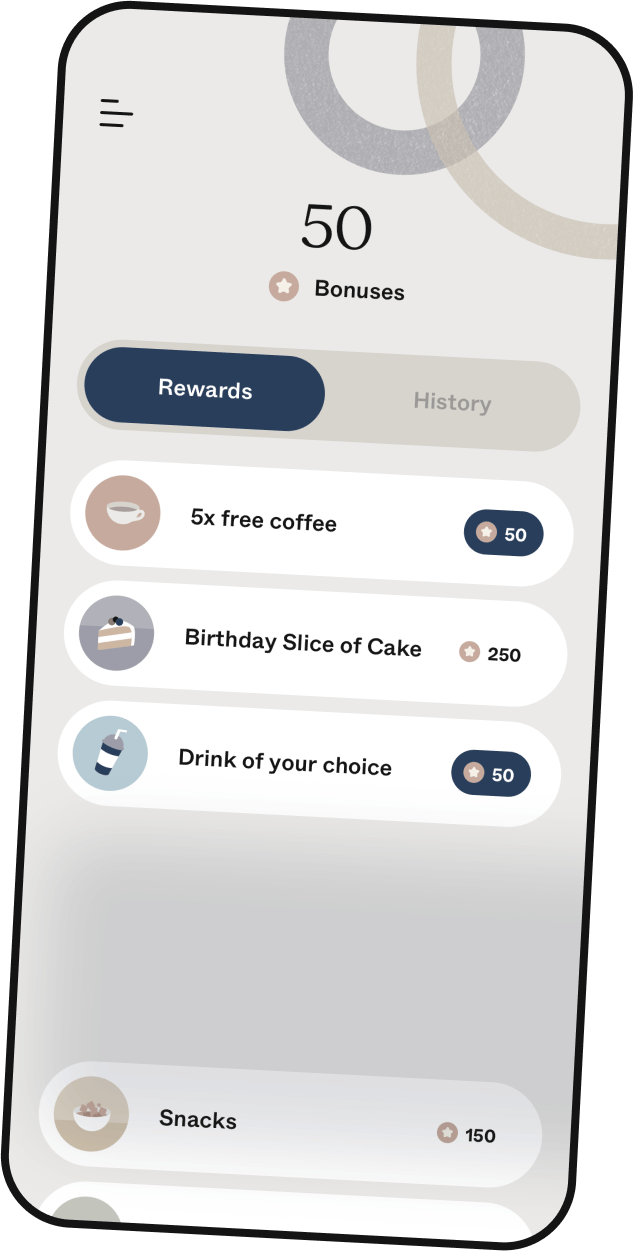

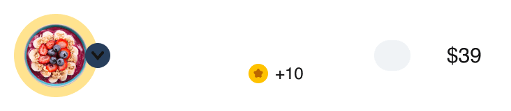
Rewards
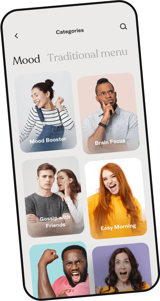
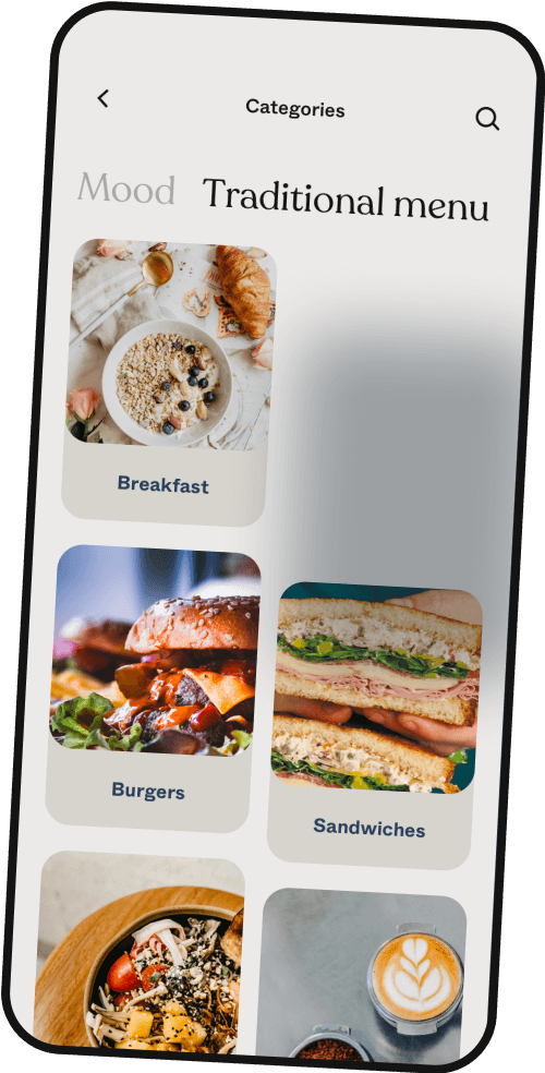

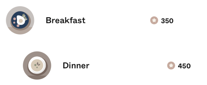
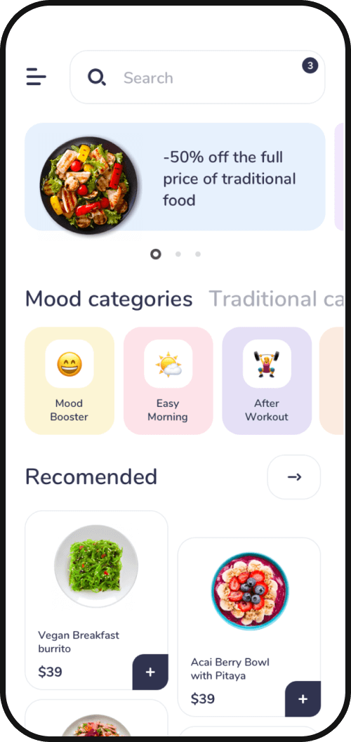
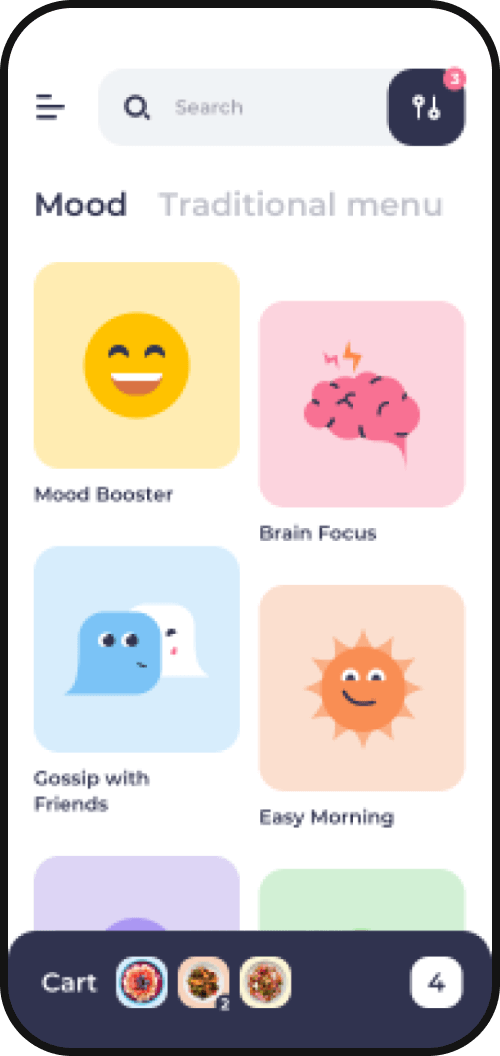
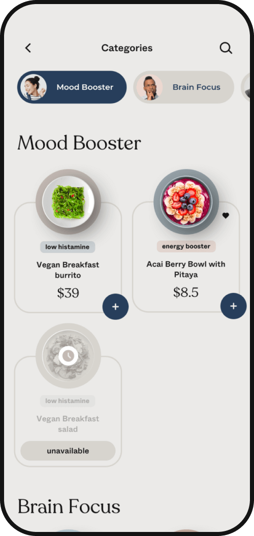
Categories for you mood
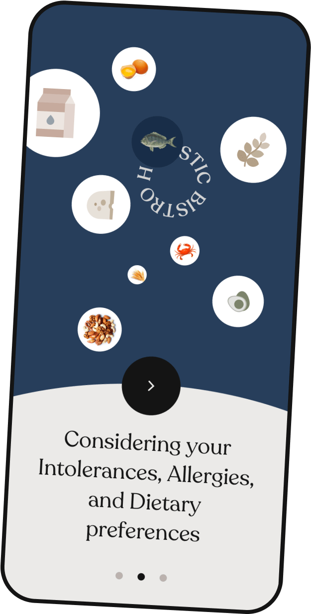
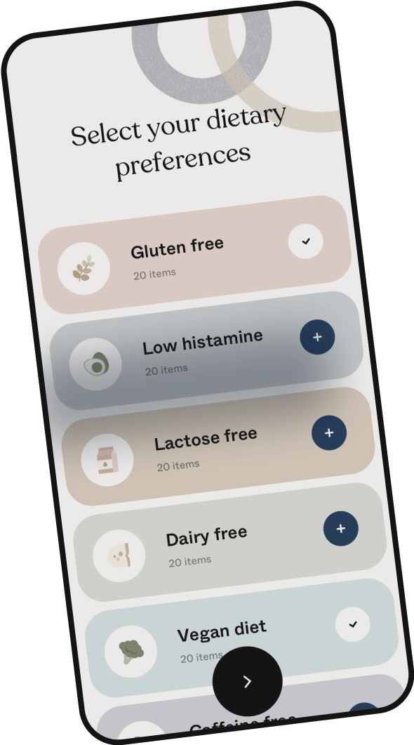


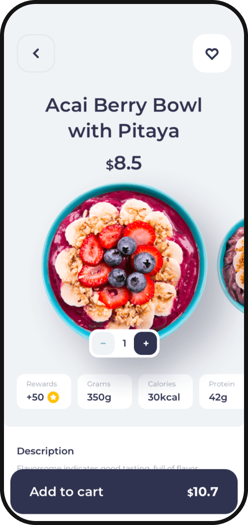
Considering your dietary
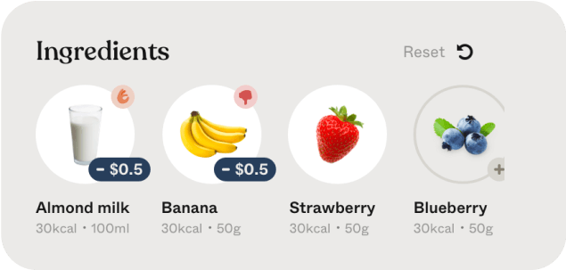
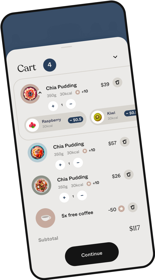
Delete or add what you like
 to delete and
  to add :) That’s easy!
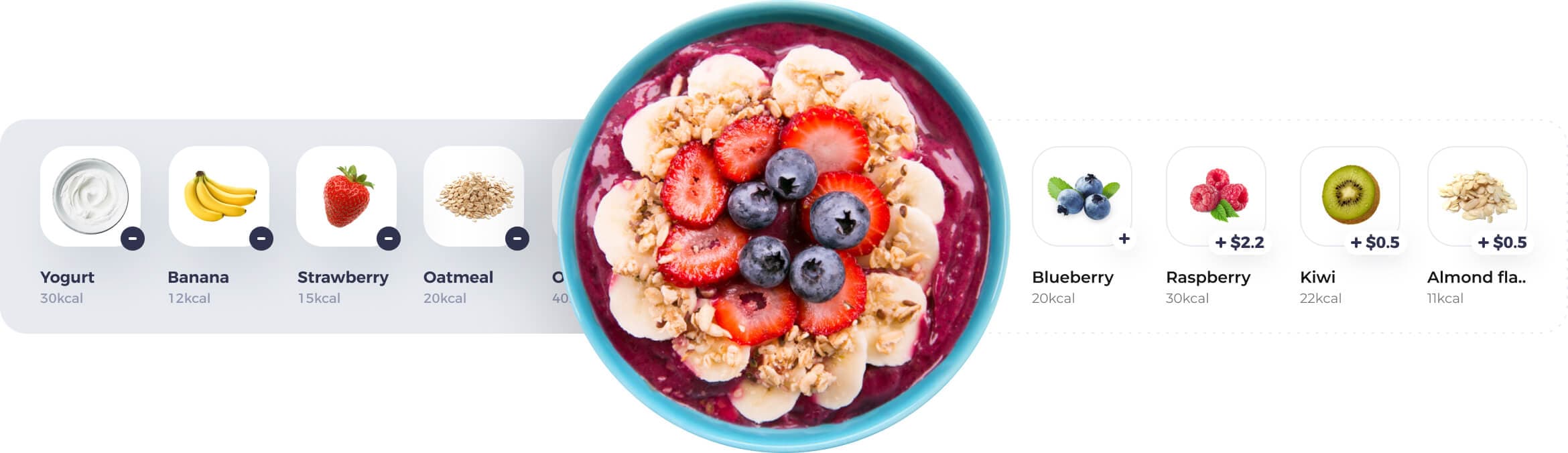
Research
Design process
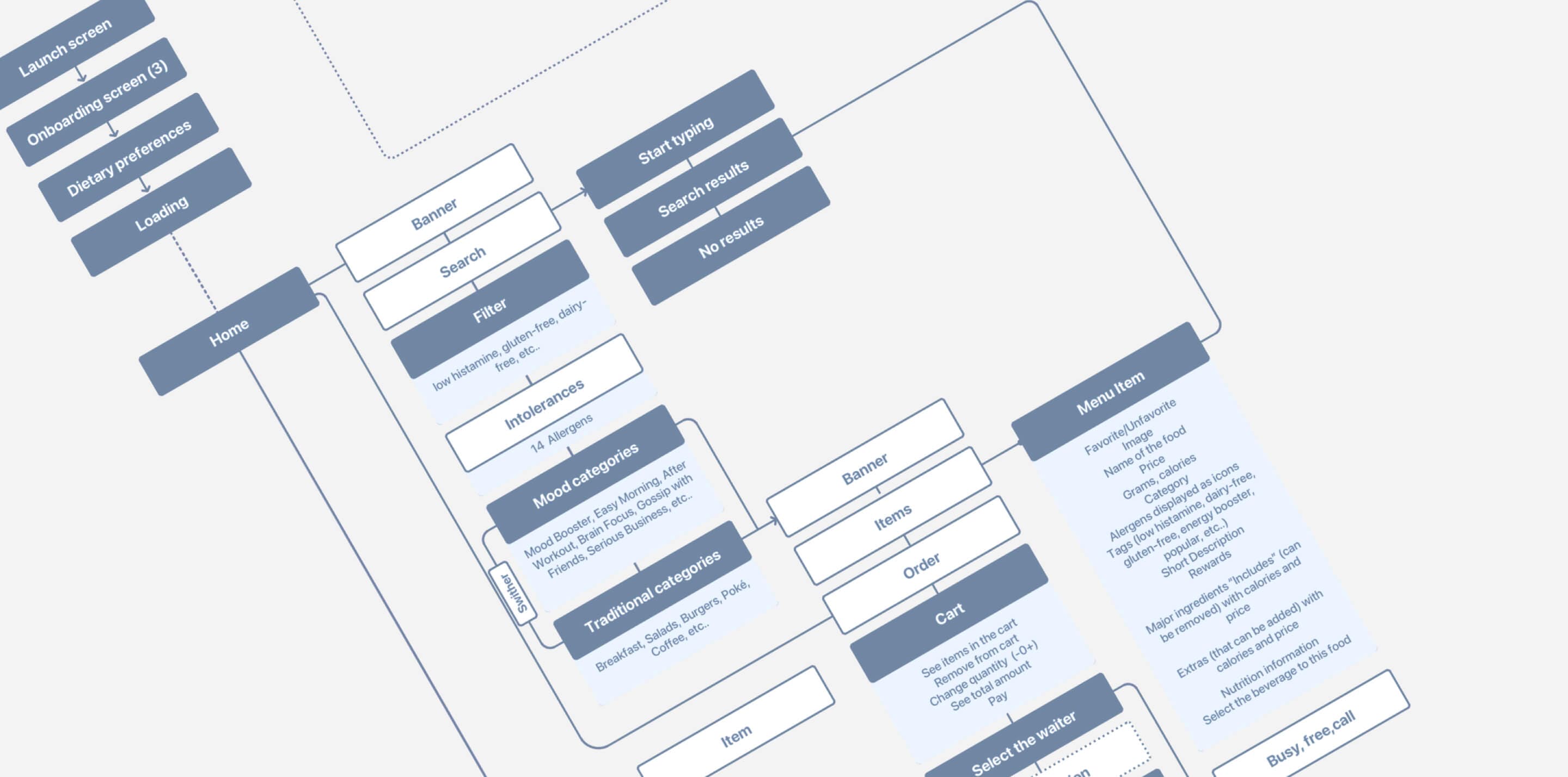
UX Wireframes
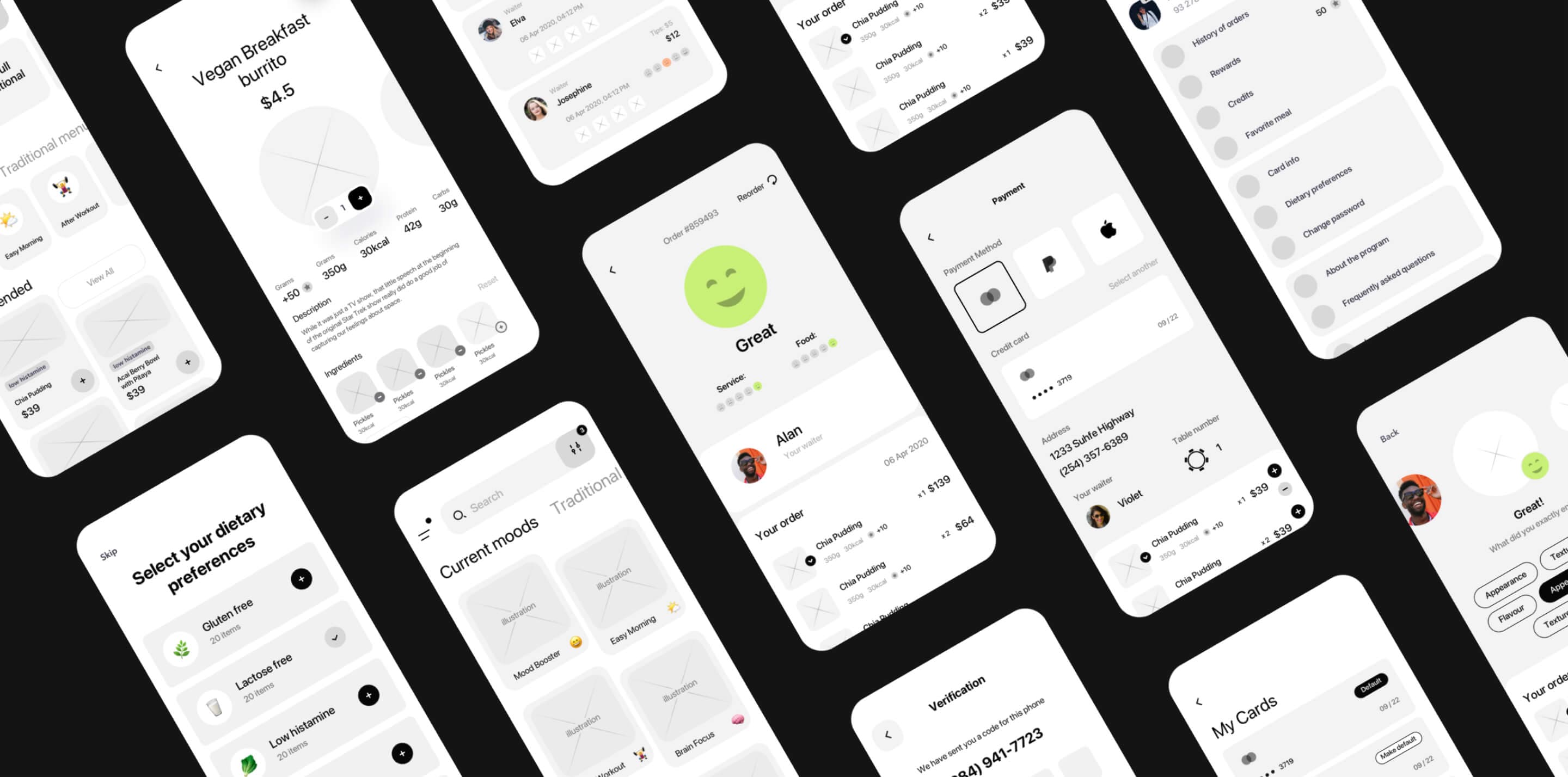
UI Design
Design Concept
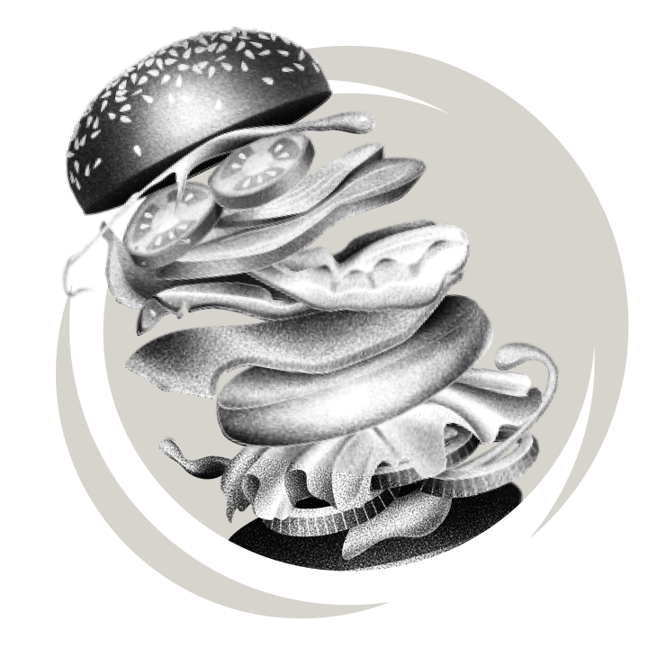
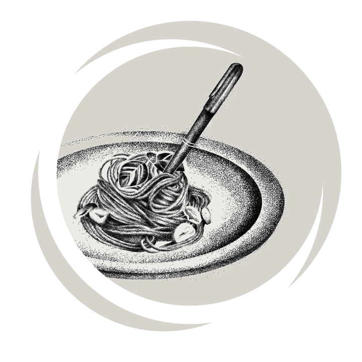
Illustrations


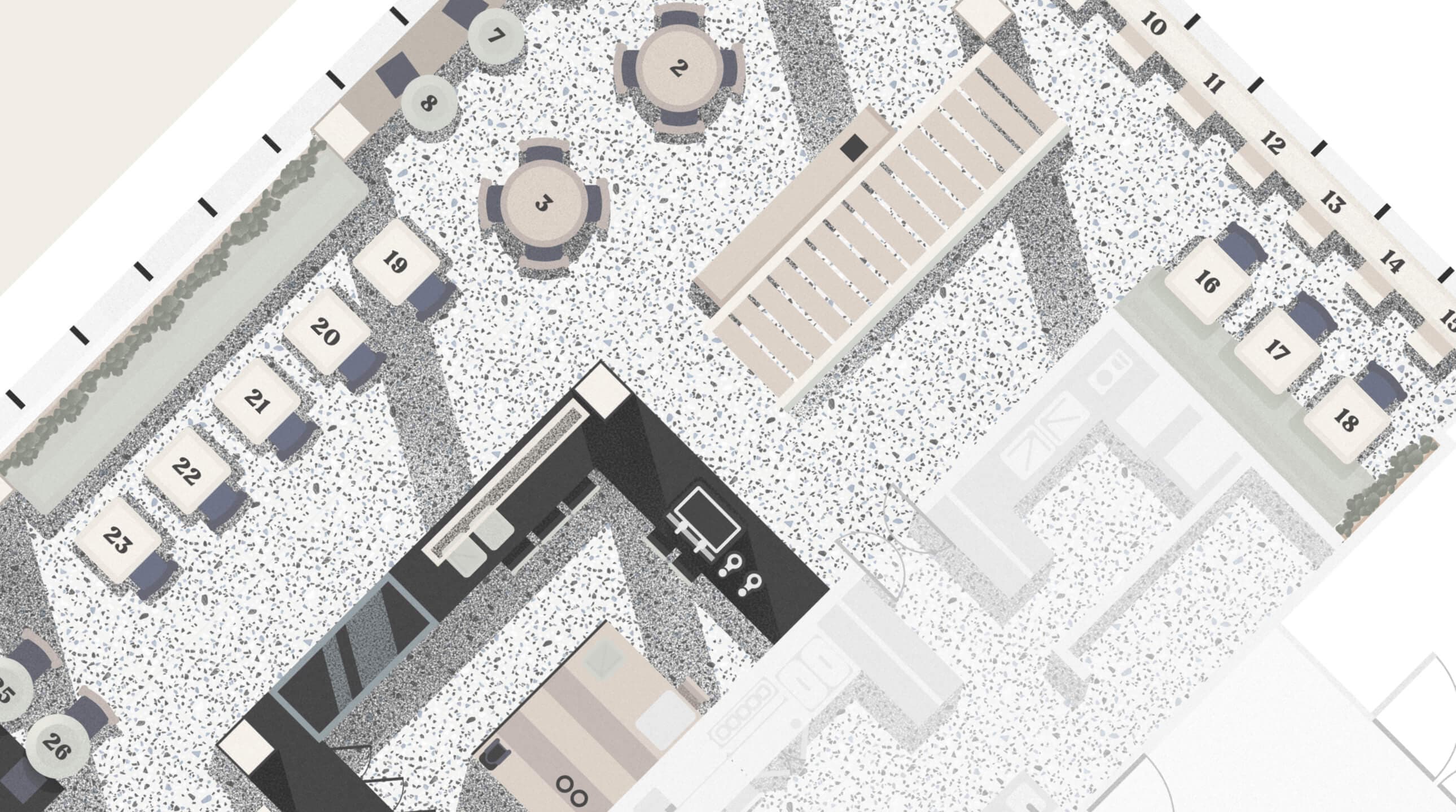
The Floor plan
Typography
Colors
Conclusion