Cleanup+ IOS Media Manager.
27 Jun 2020
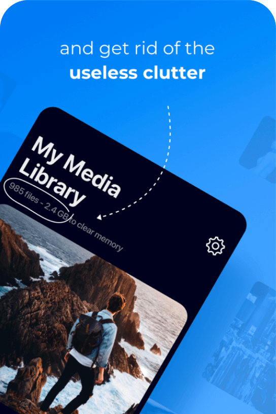
Cleanup+ is an app that makes it easy and fun to clean up media files that are stored on an iPhone.


Codeway
Client

Tech Stack


Services
#Product Strategy
#Product Design
#UI/UX
#Branding Extension
#Product Development
#Frontend Development
#Backend Development
#API Connection
#Analytics Integration
#Ongoing Production Support & Product Evolution
About project
Client and idea
Codeway, a product agency, collaborated with our team to create an app that can detect and delete similar or duplicate photos, videos, and screenshots from your phone. The app uses smart algorithms to organize a photo library and free up the phone memory.
Challenge & Goals
Our goal was to create a well thought-out interface for a perfect phone cleaning app. Finding a unique niche in the market with strong competitors made this task both challenging and rewarding for our team.
Solutions & Result
We thoroughly researched the market, analyzed user comments, and identified their major pain points. Using this information, our team has carefully crafted a design prototype, which we tested, polished, and optimized for a seamless user experience. As a result, our team produced a high-quality comprehensive UI design that effectively addresses user needs.

Kumsal Pınargözü
Product manager, Codeway
Upon launching, the client is confident to say that their product has the best UI/UX design among its competitors. The client gives credit to Tino Digital Agency’s satisfactory skills in design and development and their openness to applying changes depending on the feedback that they are provided with.

5
M
Downloads
1.3
M
Active User
4.7
Average App Rating
project Overview
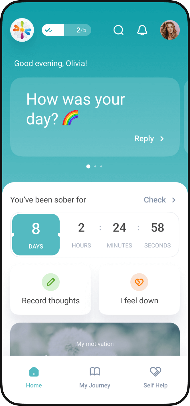
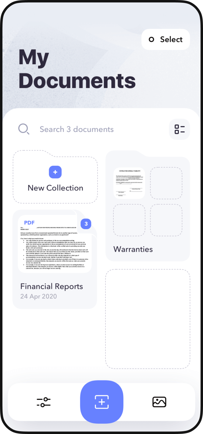
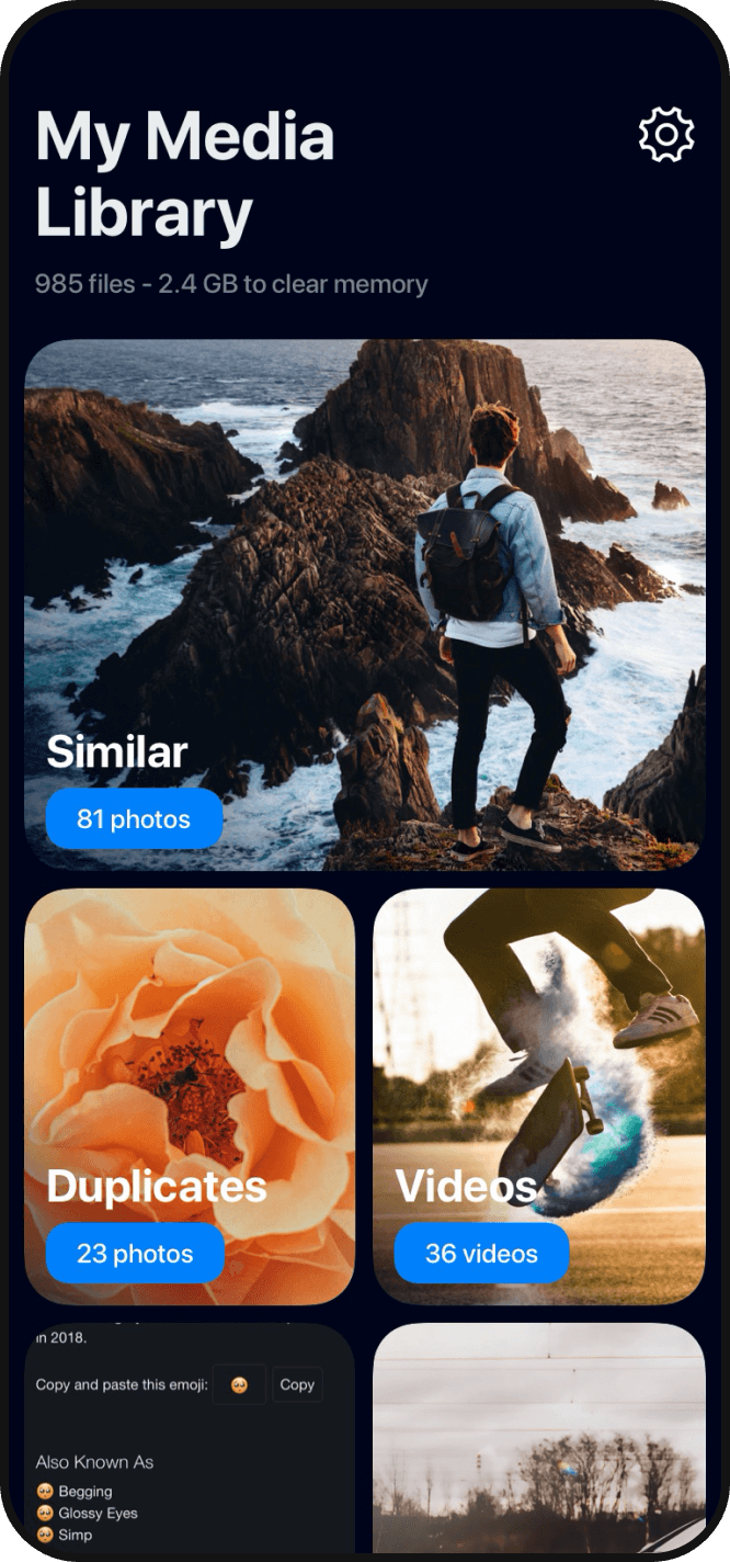
Main app features
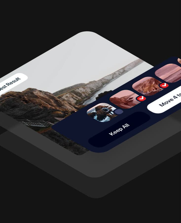
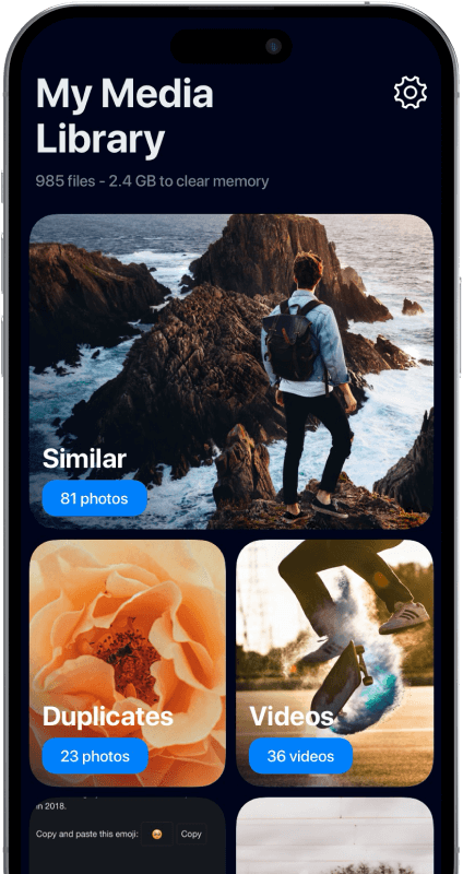
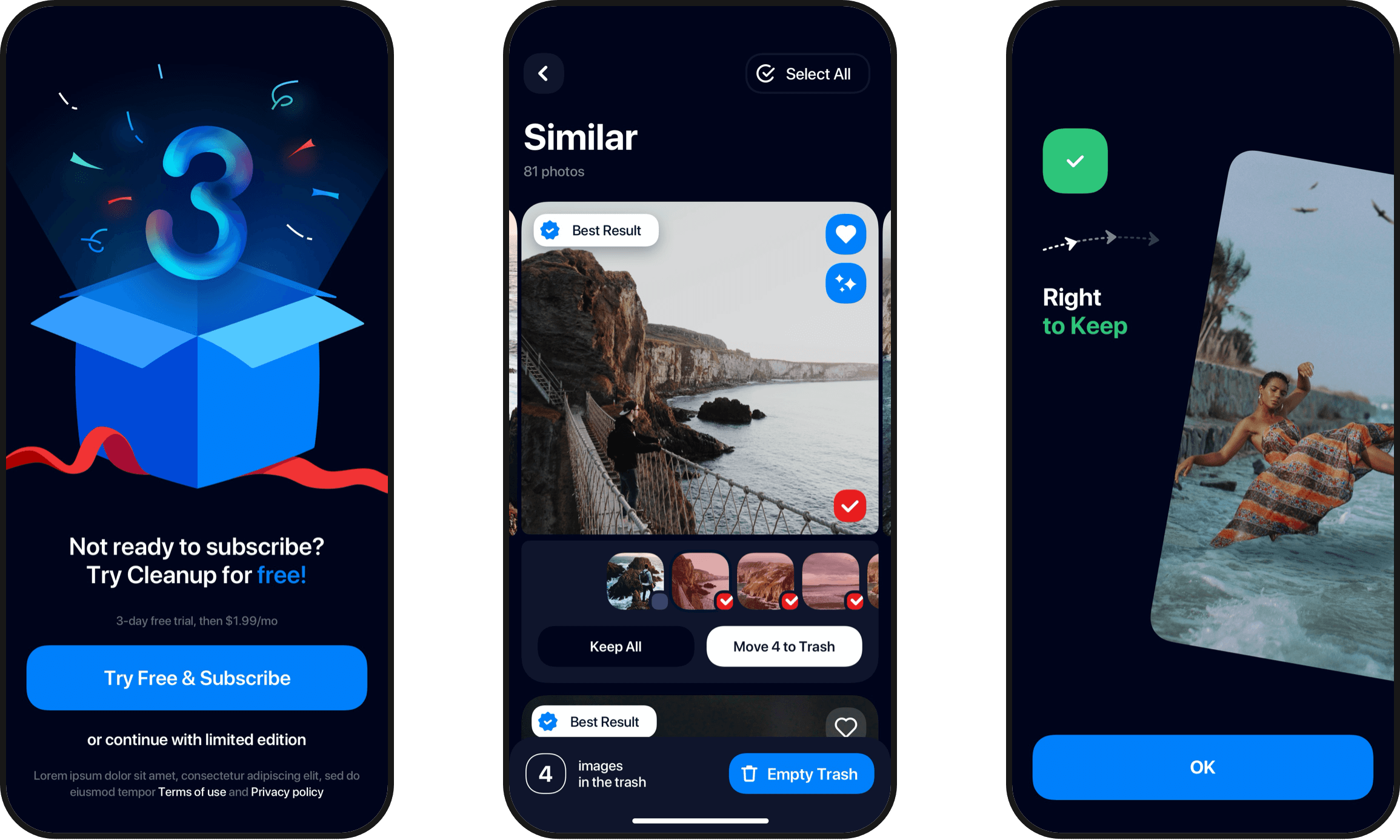
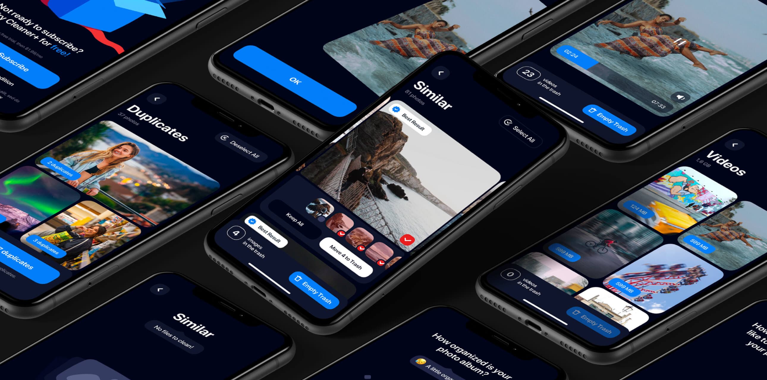
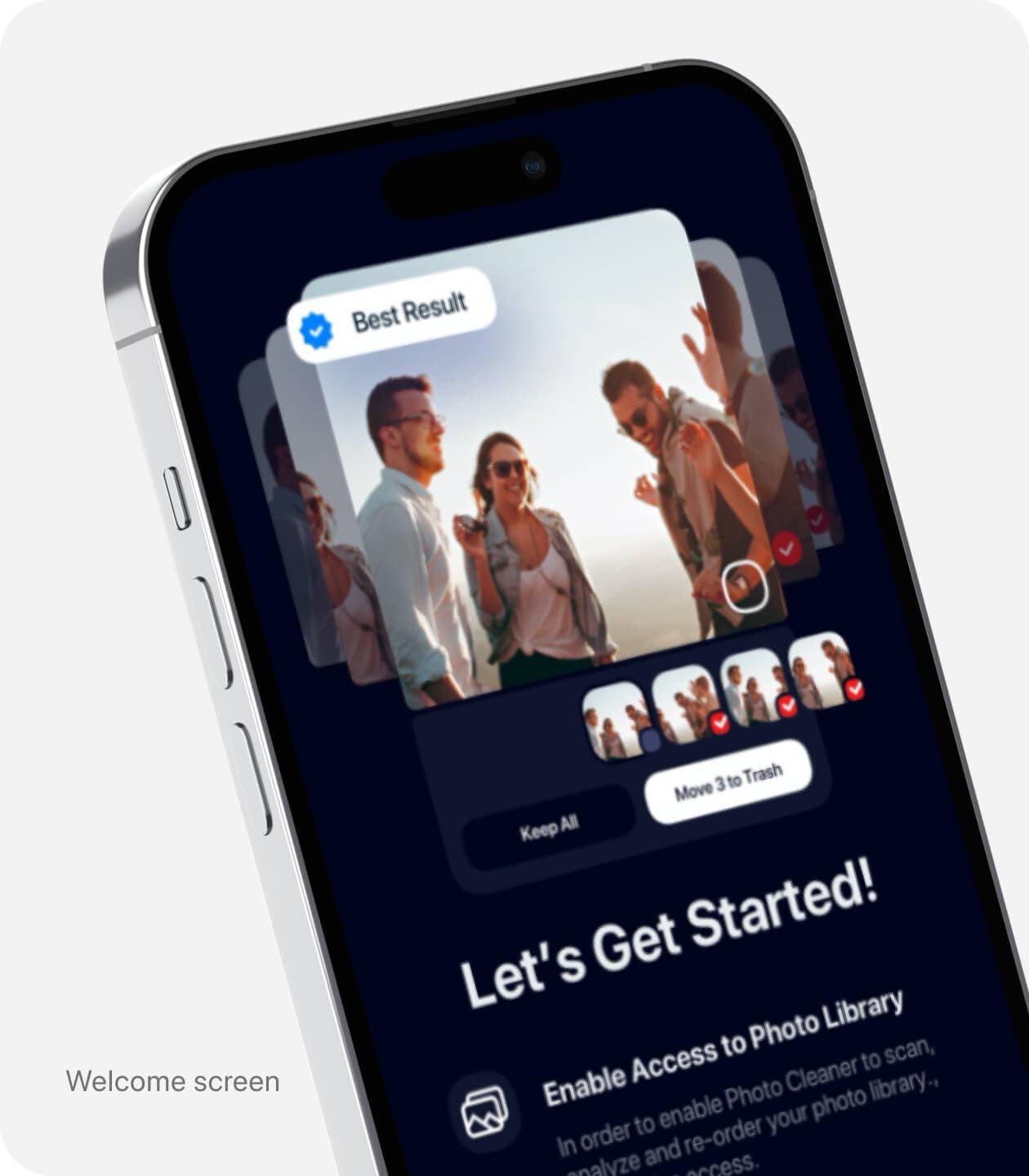
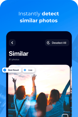
Cleanup+ was designed to make the process of freeing up space in the media library easier and more enjoyable. The main sections of the app include organizing Similar photos, Duplicates, Videos, and Screenshots.
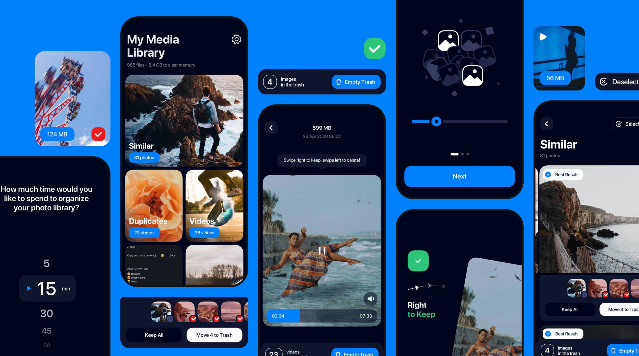
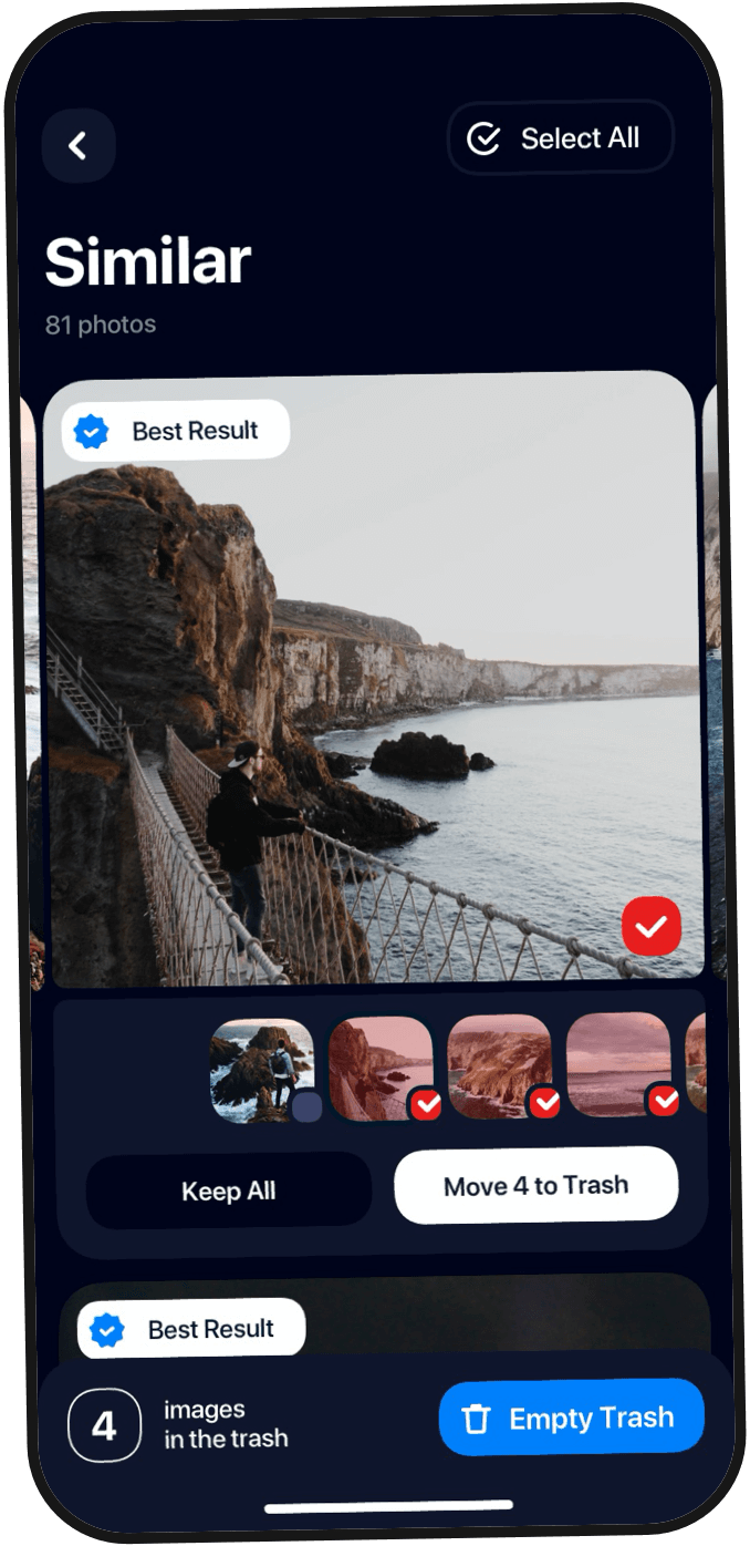
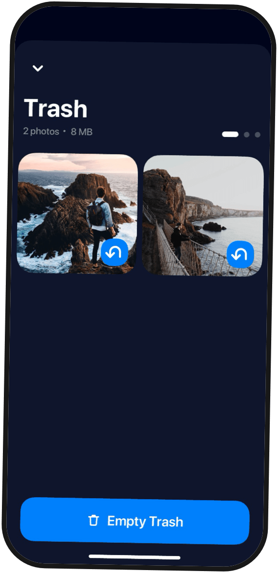

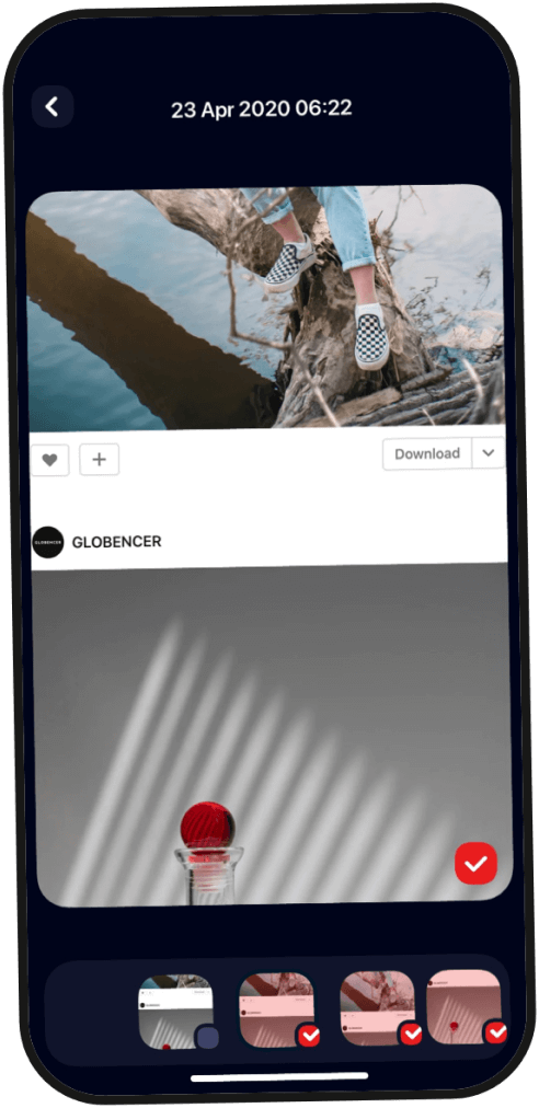
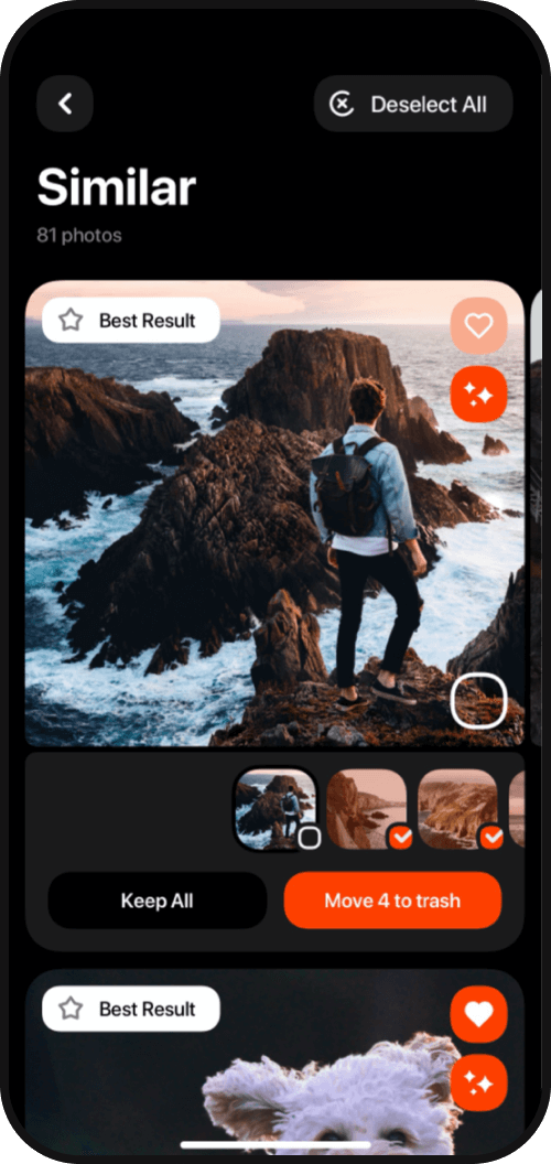
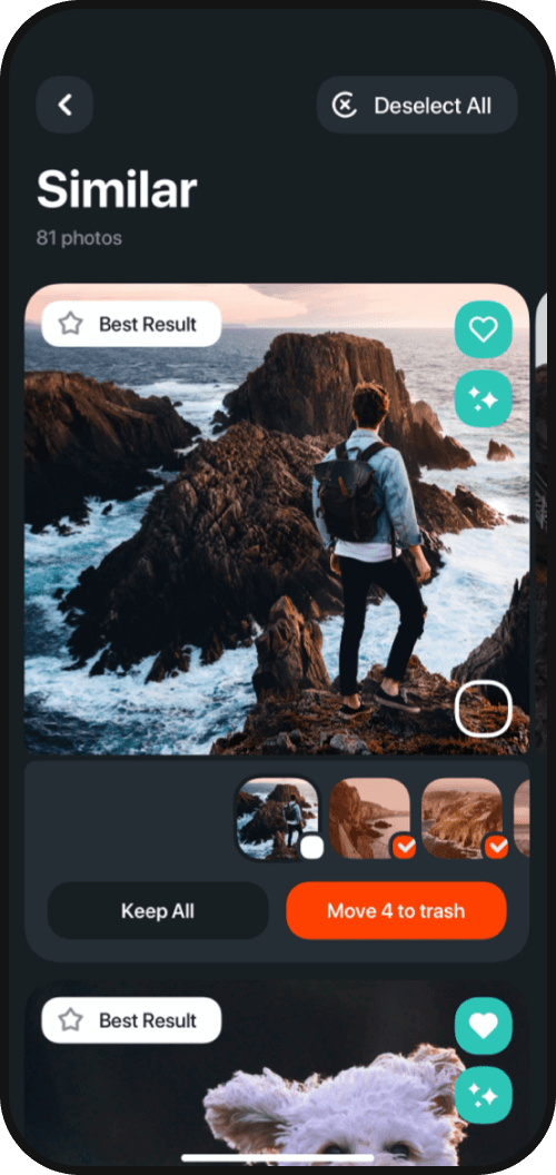
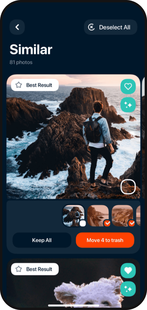
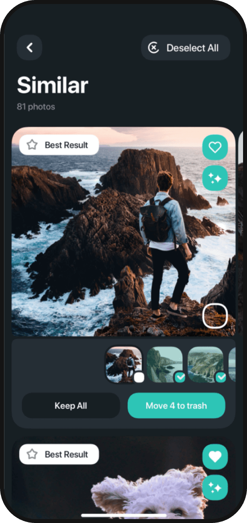
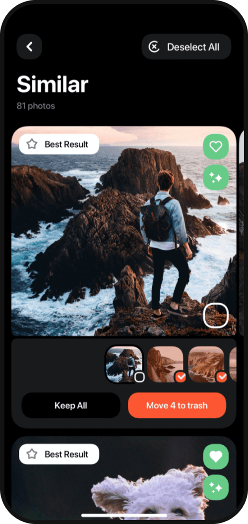
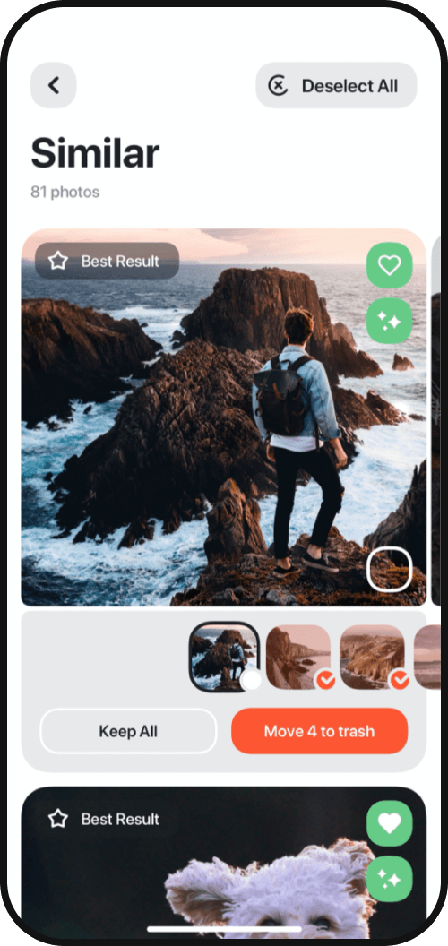
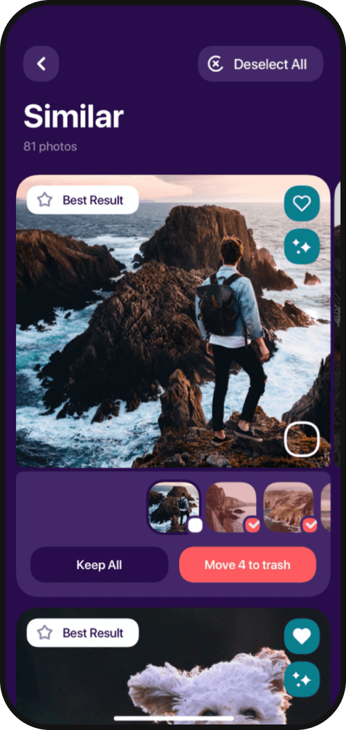
Similar
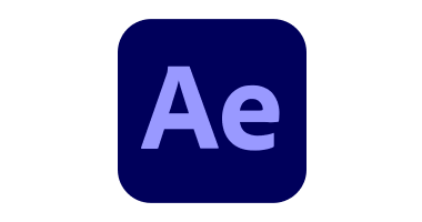
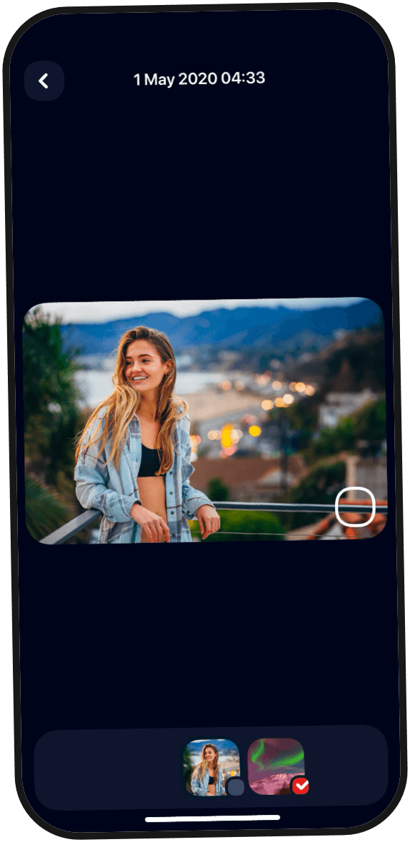
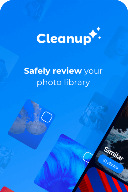
The app identifies similar photos and helps to sort between the photos users want to keep and the photos they want to delete. The algorithm detects less than perfect photos and automatically selects them so that they can be easily moved to the trash and deleted. Alternatively, users can select photos they want to delete manually.
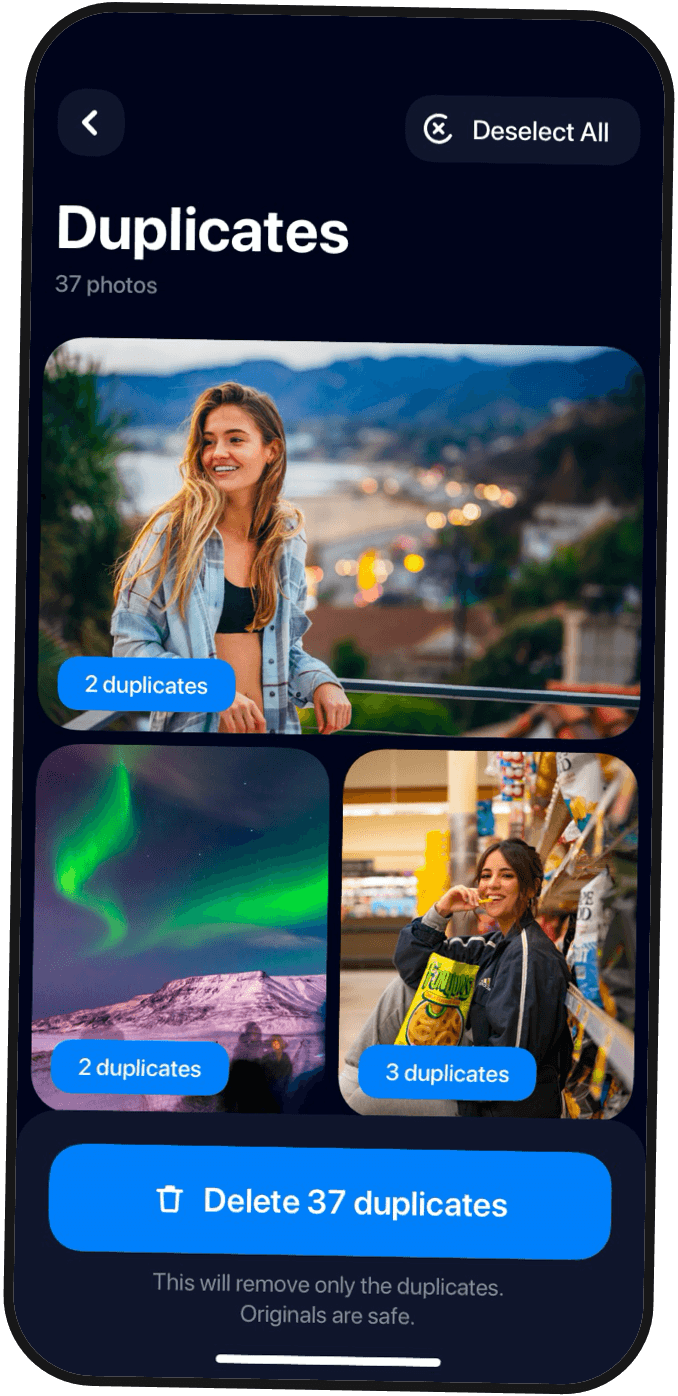

Duplicates
Another important feature of the app is its ability to identify duplicate photos and images. An error-free identification system allows users to select all found duplicates and delete all of them with one click.
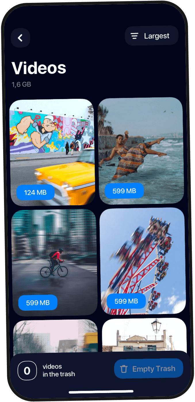

Videos
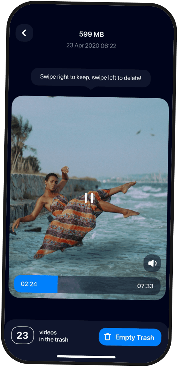
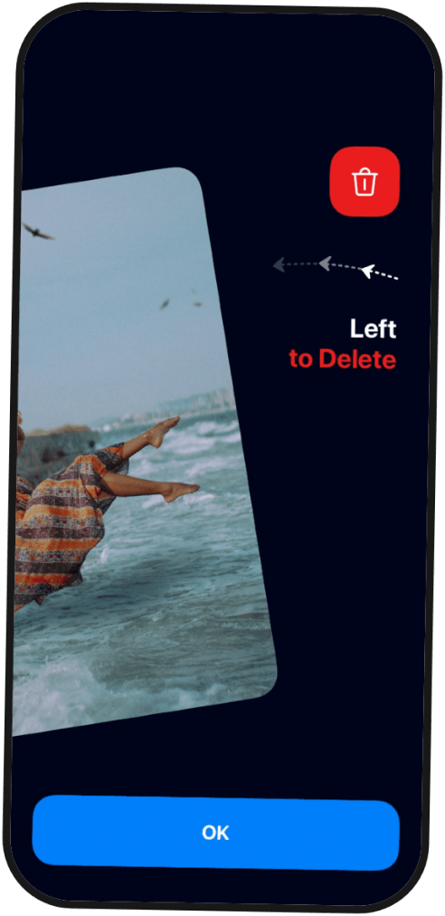
Cleanup+ offers a convenient interface to review videos. Each video is displayed along with the amount of space it takes up in the phone memory. Users can conveniently access the video player mode, where they can watch a video and either keep it or move it to the trash by swiping left or right.


Screenshots
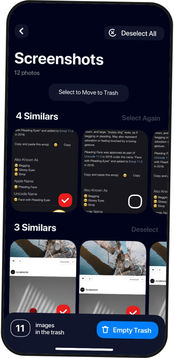
The app identifies all the screenshots on a device. Users can choose to delete all of them with one click. For convenience, screenshots are grouped by similarity, and the user can select either the whole group or individual files and move them to the trash.
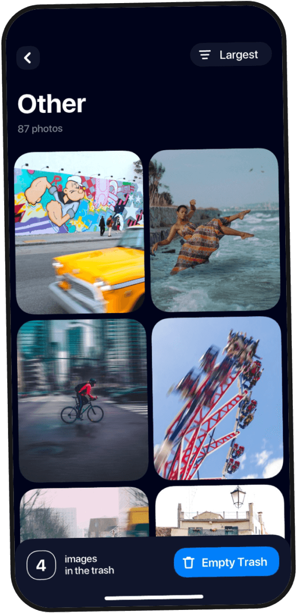


Other
The section 'Other' stores all other images on a device that are not listed in the categories mentioned above. Users can review each image on a separate screen and either delete or keep it using the swipe action.
Design process
Research
Our team conducted market research, identified apps with similar functionality, and thoroughly analyzed user reviews. Based on the information gathered from positive and negative feedback, we were able to clarify user needs and identify their pain points. This stage was crucial in helping our team to optimize user experience so that it uniquely resonates with a specific group of people.
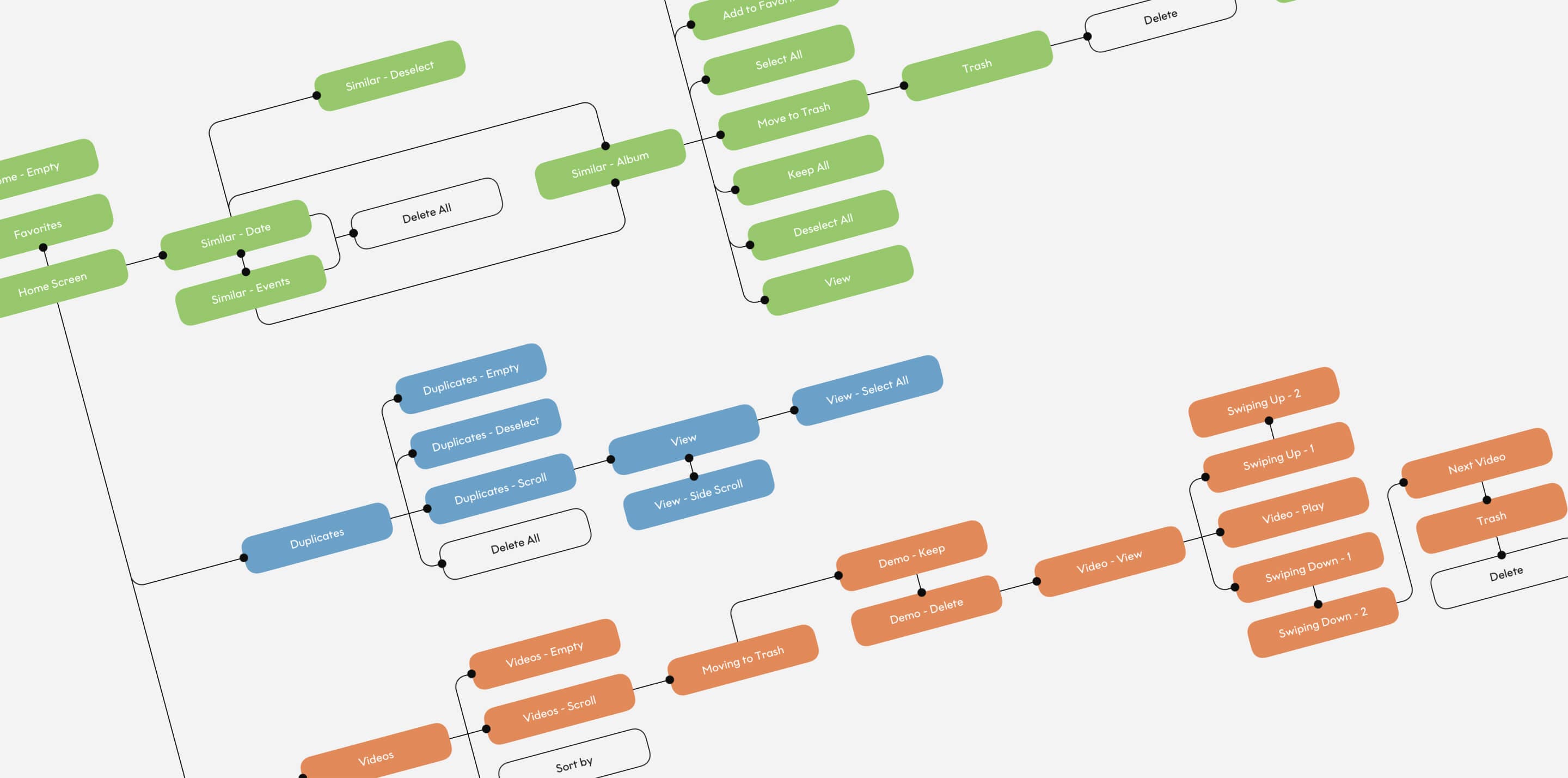
Sitemap
Design process
The next step was creating a sitemap to look at the structure of the whole app and map out a typical user journey. At this stage, our team focused on every detail of the navigation flow, which streamlined the process of wireframe design.
Design process
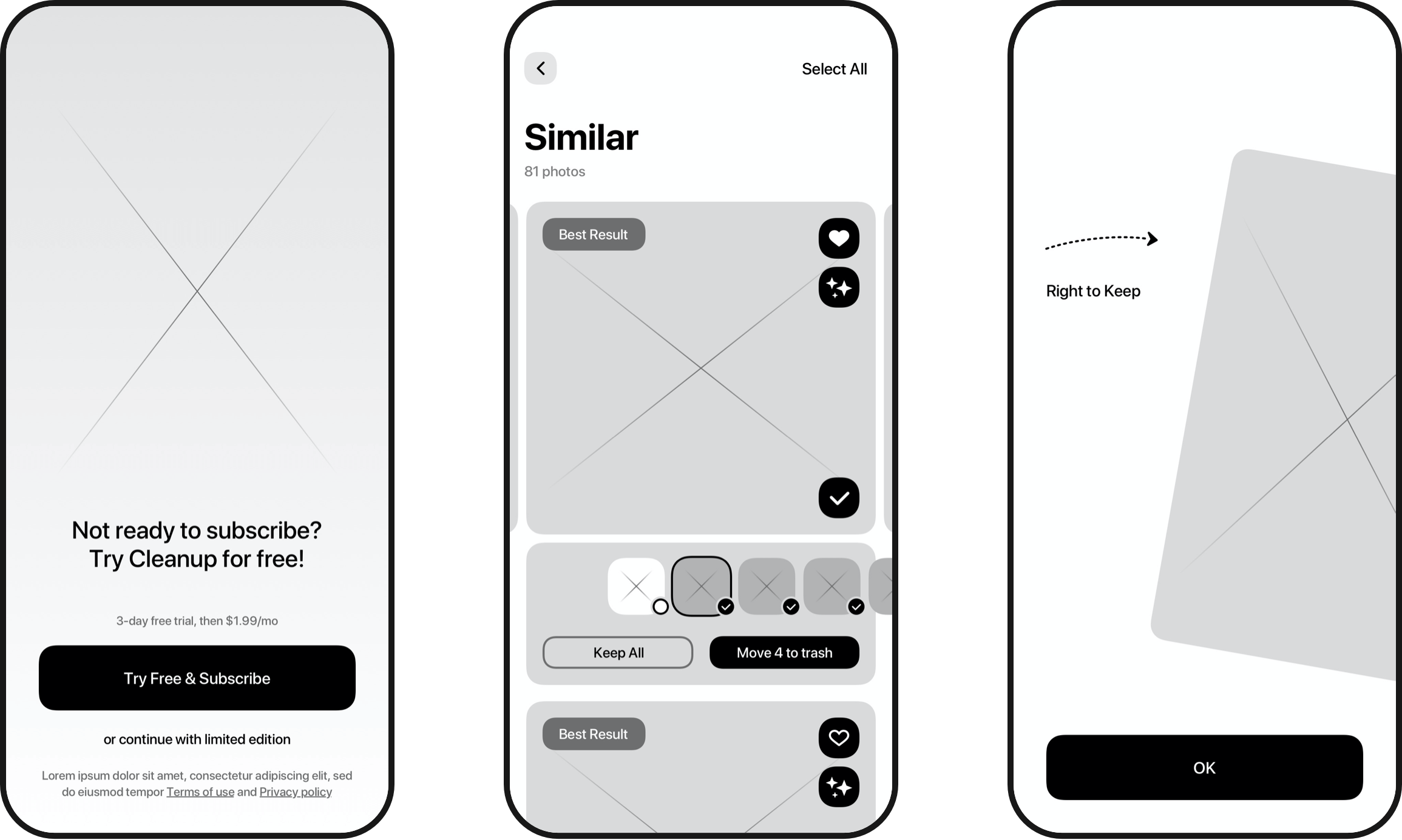
UX Wireframes
We created wireframes for every screen and every state of the interface. This allowed our team to conduct effective usability testing. As a result, we created the final version of a comprehensive prototype, which the our development team could immediately start working with.
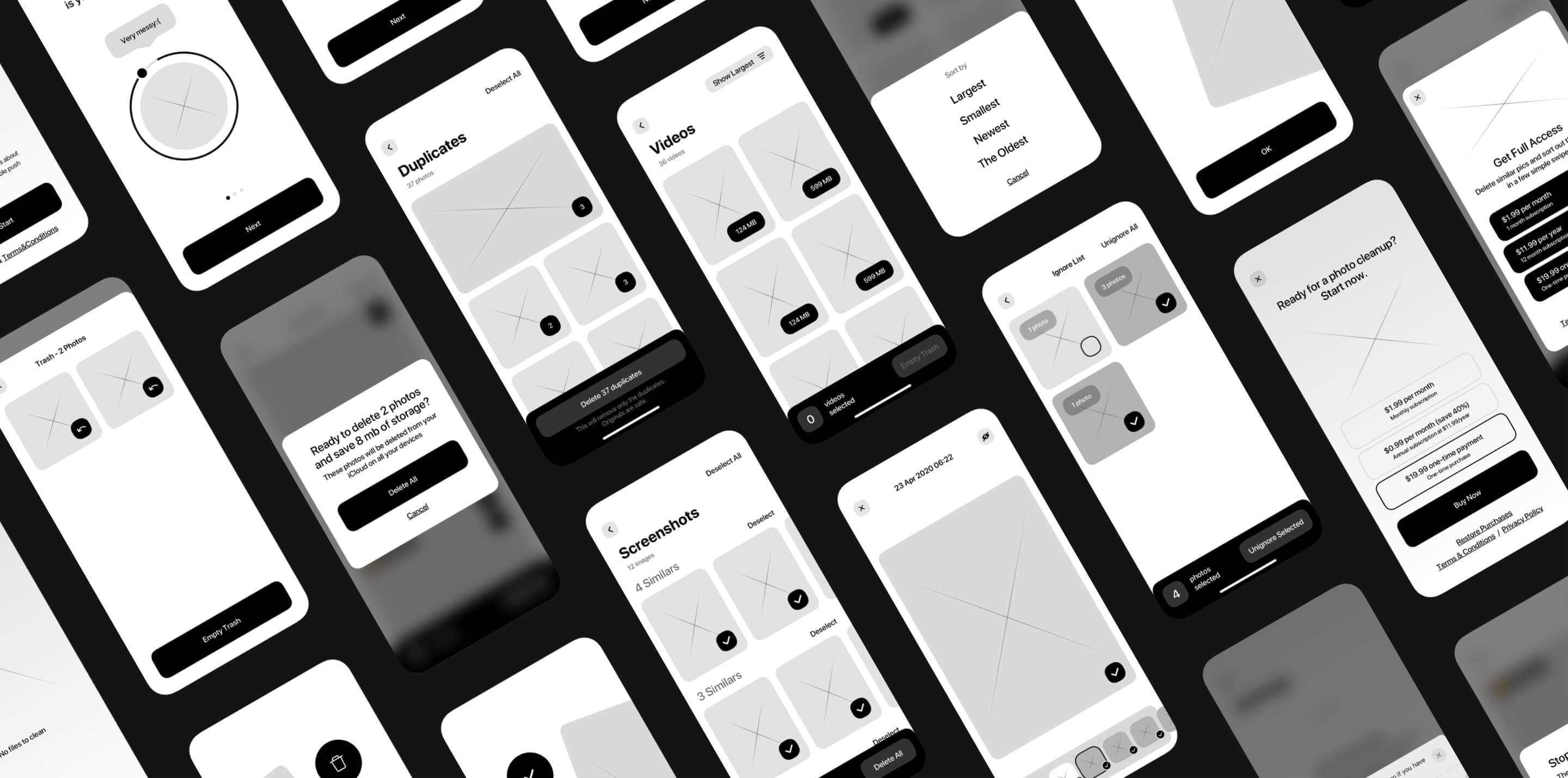
UX wireframes were created taking into account Apple recommendations for interface design to produce a native and familiar look for maximum user comfort.
Design process
UI Design
Every UI component was carefully thought out by our team in terms of its functionality and user interaction. To add an extra layer of user engagement, we incorporated microinteractions at the level of animated buttons, icons, and gestures.
Design Concept
The design concept was created taking into account modern trends in UI design and Apple iOS. The color scheme was chosen to enhance the branding message and maximize user comfort.
Illustrations
Unique illustrations and animations were used to empathize with the users and make interface design easily recognizable and visually appealing.
After the UI design was completed, it went through another round of user testing. Based on the insights received at this stage, we polished the interface and adapted it to devices with different display sizes.


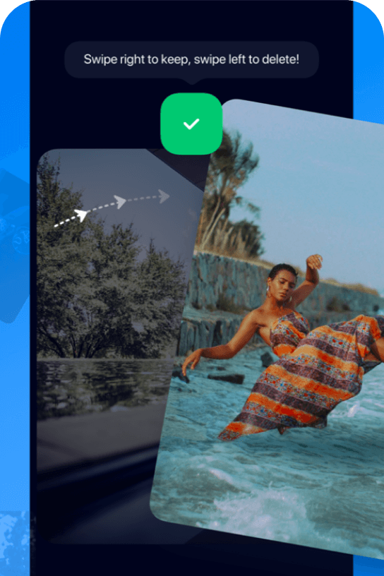
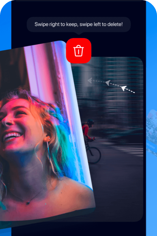
Left to Delete
In the sections 'Videos’ and 'Other', users can send a file to the trash by swiping left or keep it and move to the next file by swiping right.


Right to Keep
A swipe motion saves users' time and makes their experience of interacting with the app seamless.
Animations
Animations and microinteractions make the user experience more enjoyable and engaging.
Branding
Logo
The final version of the logo reflects the feelings of cleanliness, spaciousness, and magic that are eloquently communicated using white sparkles on a blue background.
Branding
Typography
For this app, we selected a standard and familiar iOS font, SF Pro, that would not distract users' attention while guiding them through the user journey.
SF Pro Display
RegularMediumSemiboldBold
AaBbCcDdEeFfGgHhIiJjKkLlMmNnOoPpQqRrSsTtUuVvWwXxYyZz
010203040506070809
Branding
Colors
We selected neutral blue as the main accent color to help users focus their attention on their interaction with the app. Also, red and green colors were used to either delete or keep files. We applied this familiar color code method that is intuitively recognized by the users.
#2EC479
Emerald Green
#0080FB
Azure Blue
#E91D1D
Rose Red
Conclusion
We enjoyed collaborating with our client at every stage of product creation. Their team was always available to provide timely and insightful feedback. Well-coordinated teamwork on both ends ensured continuous transfer of completed sections to the client's development team and, therefore, shortened the app development timeline.
Cases