Scanner+ IOS File Manager.
09 Sep 2020
Scanner+ is a full-featured scanning app that allows you to edit, sign, share, save, and manage your files.


Codeway
Client

Tech Stack


Services
#Product Strategy
#Product Design
#UI/UX
#Branding Extension
#Product Development
#Frontend Development
#Backend Development
#API Connection
#Analytics Integration
#Ongoing Production Support & Product Evolution
About project
Client and idea
Codeway is a product agency and our long-term partner. They brought our team on board to create a scanning app that offers outstanding user experience and attractive user interface design.
Challenge & Goals
Given that the market is saturated with many strong competitors that provide similar functionality and decent design, Scanner+ had to really stand out in every dimension. Our goal was to create a complete package, where flawless user experience and enhanced functionality were combined with an elegant user interface.
Solutions & Result
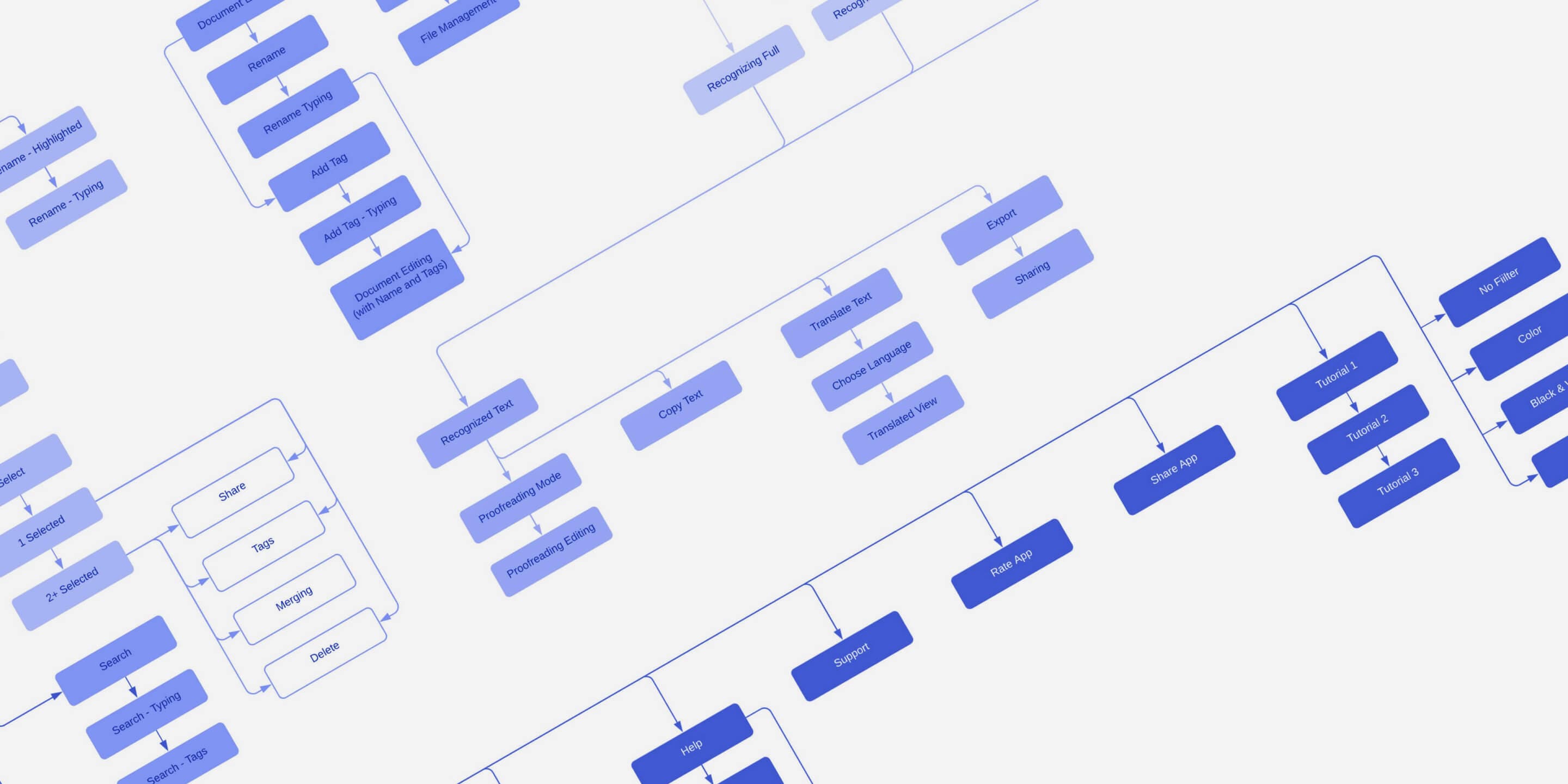
Based on research and analysis of alternative solutions, we created a comprehensive sitemap. Our team tested UX wireframes to ensure seemless transition across multpe tools. Elegant illustrations and well though-out motion design helped to create an engaging and memorable experience for the users.

Kumsal Pınargözü
Product manager, Codeway
Upon launching, the client is confident to say that their product has the best UI/UX design among its competitors. The client gives credit to Tino Digital Agency’s satisfactory skills in design and development and their openness to applying changes depending on the feedback that they are provided with.

4
M
Downloads
1.3
M
Active User
4.7
Average App Rating
project Overview
Main app features
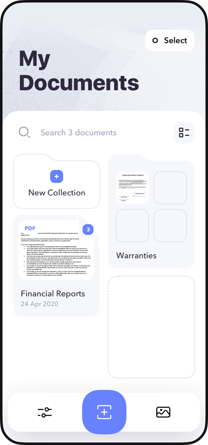
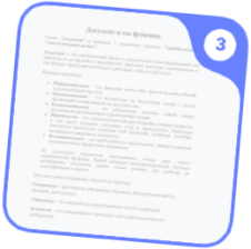
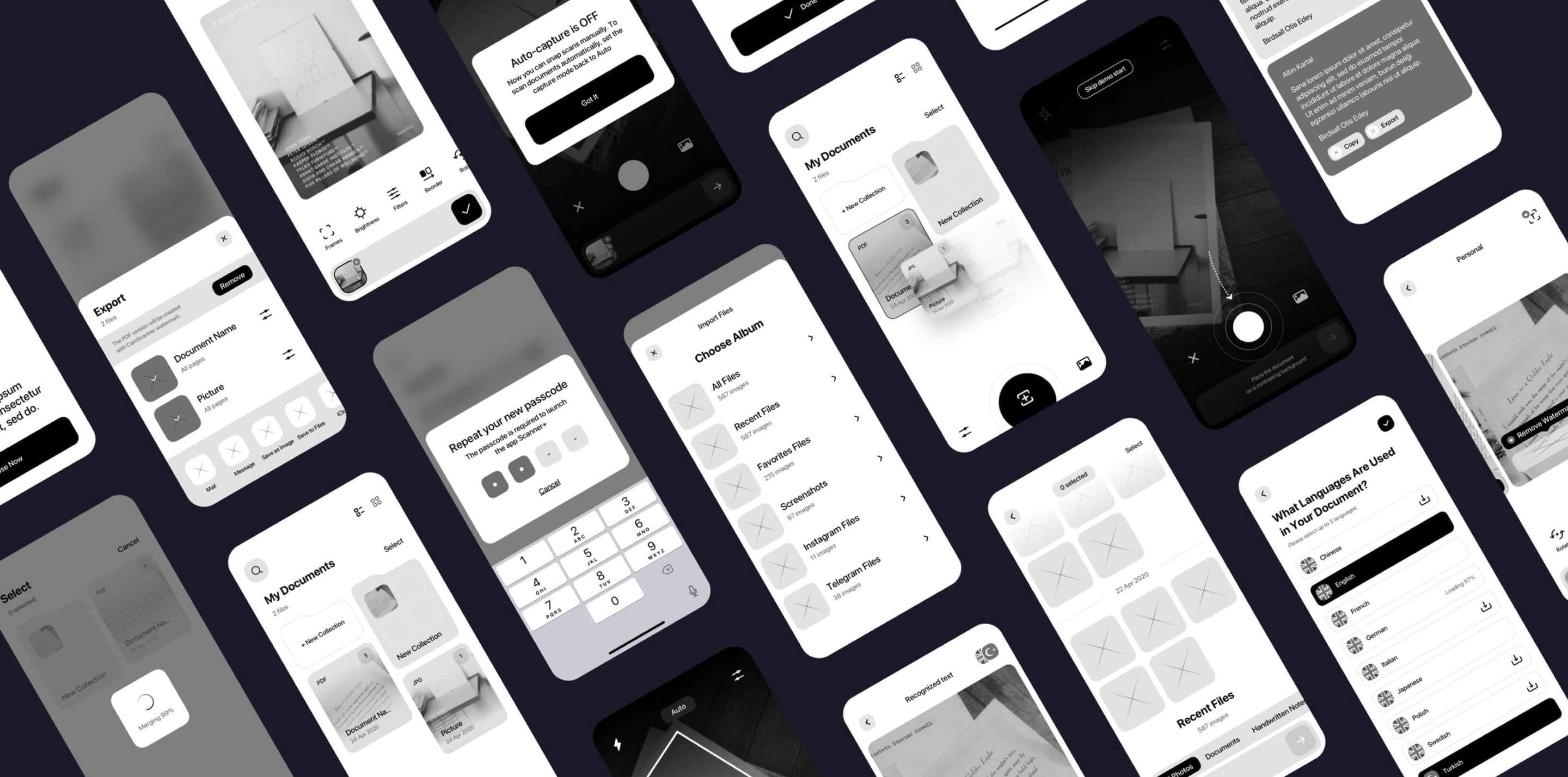
Scanner+ is a scanning app for iPhone that helps users to scan, edit, and sign documents. Moreover, users can save files in a convenient format and share them on multiply platforms directly from the app.
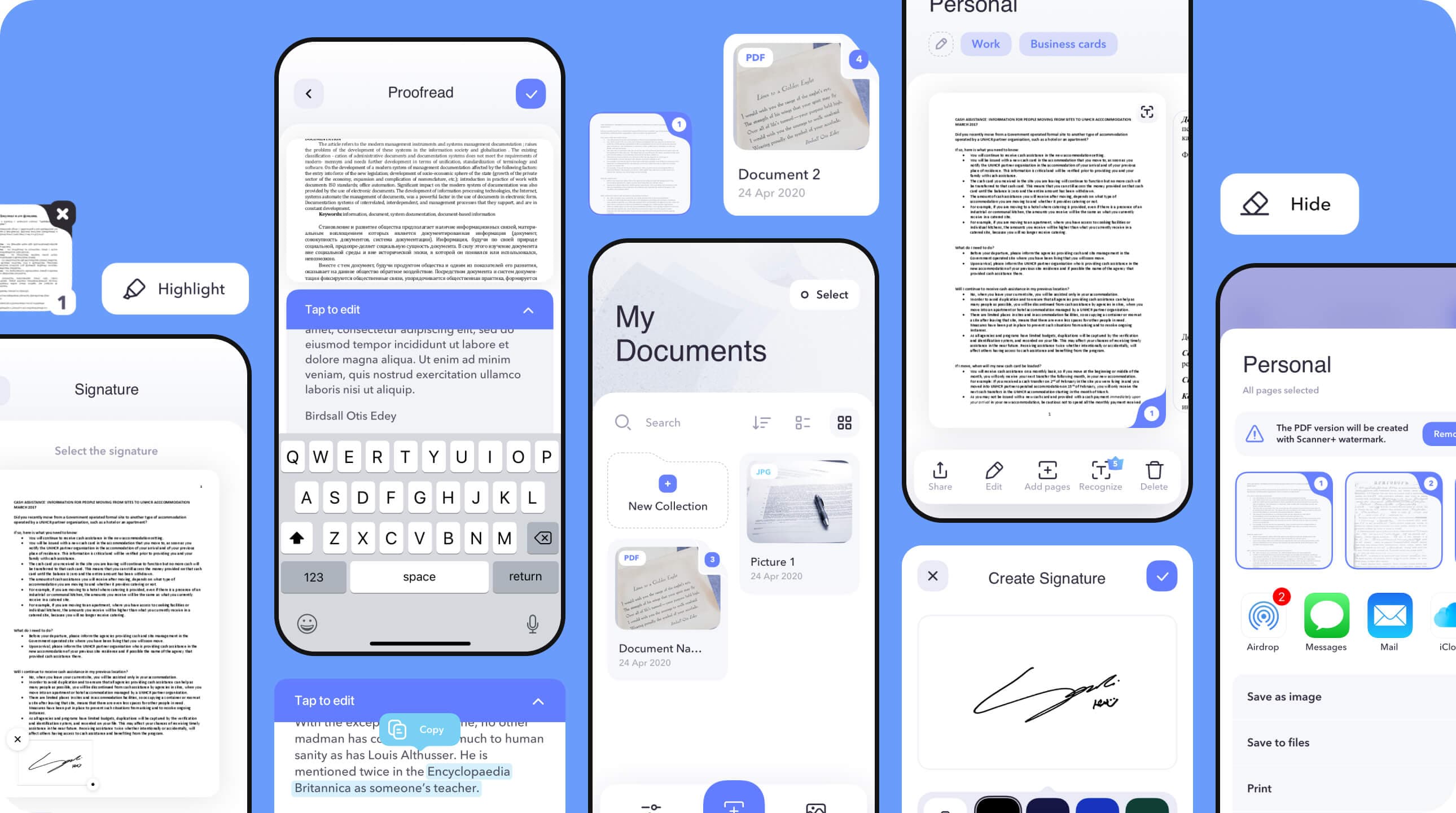
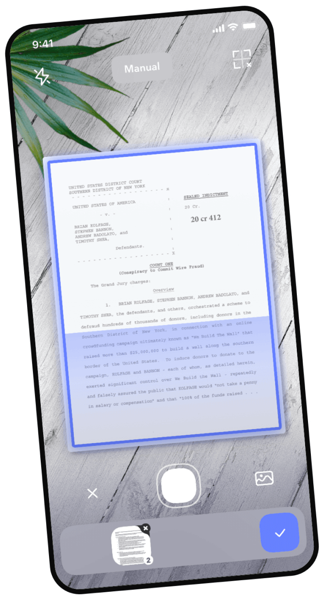
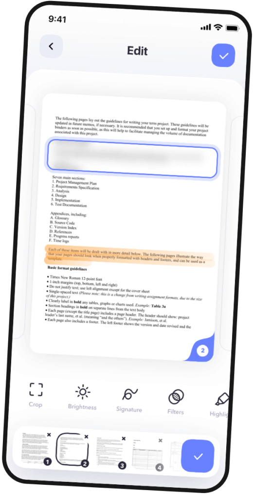

Scan & Edit
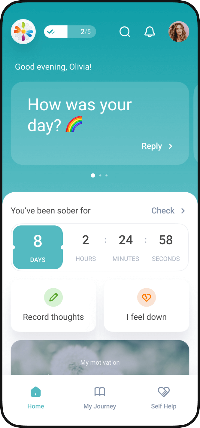
The app allows users to easily scan one- or multi-page documents and edit them within the same app. The main navigation is located at the bottom of the screen. However, 49% of users interact with their phones using one hand. To ensure seamless user experience, we added an option to swtich between tools us with a swipe motion.
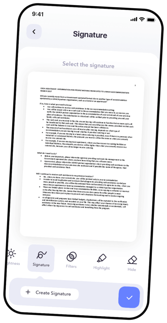
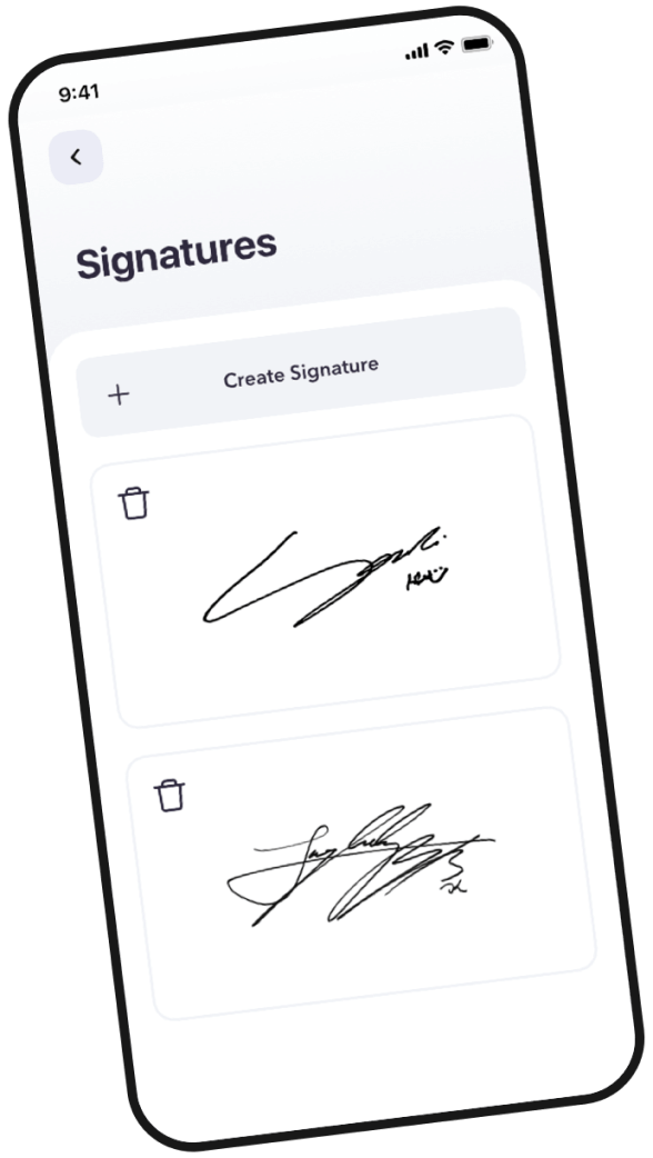
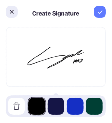
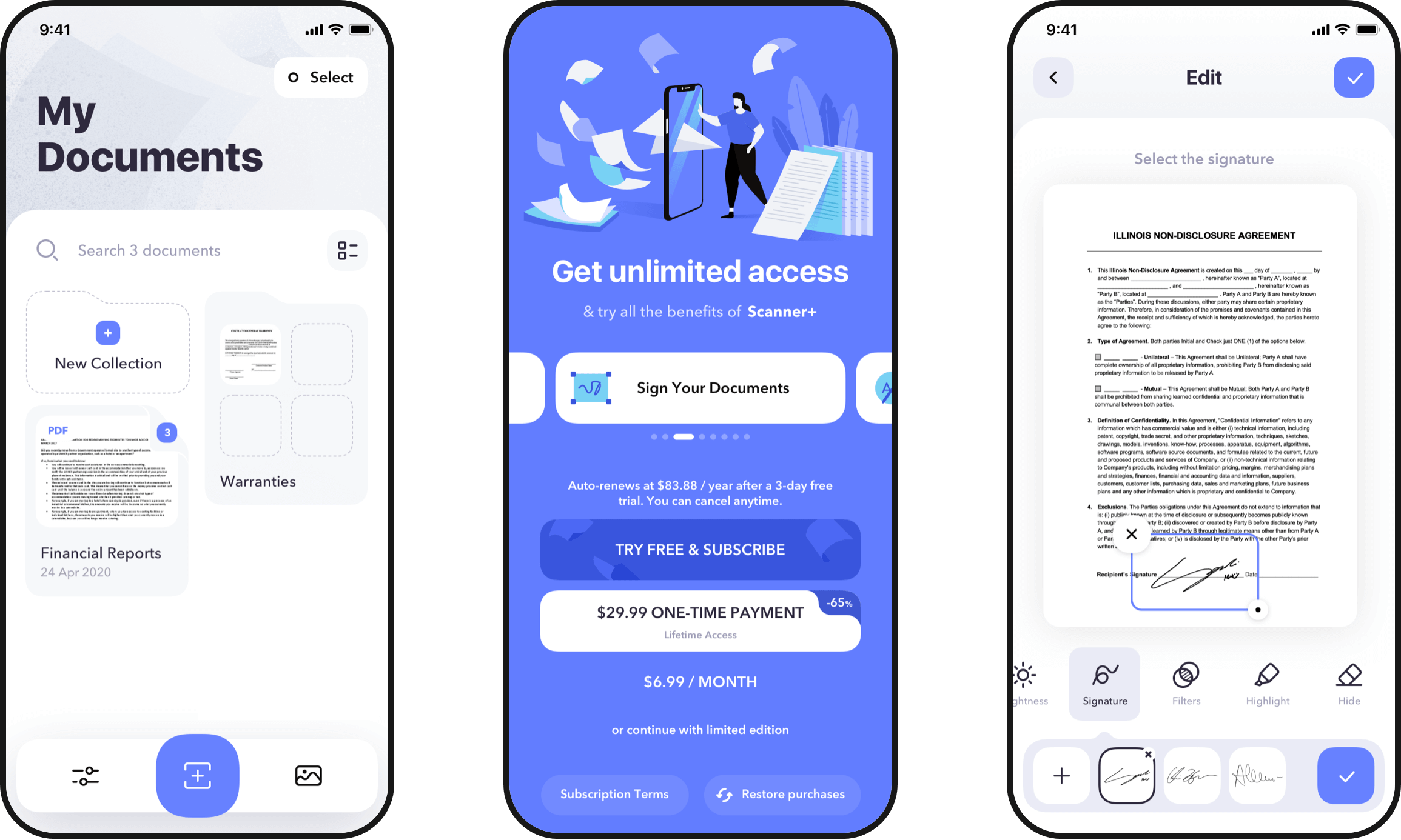
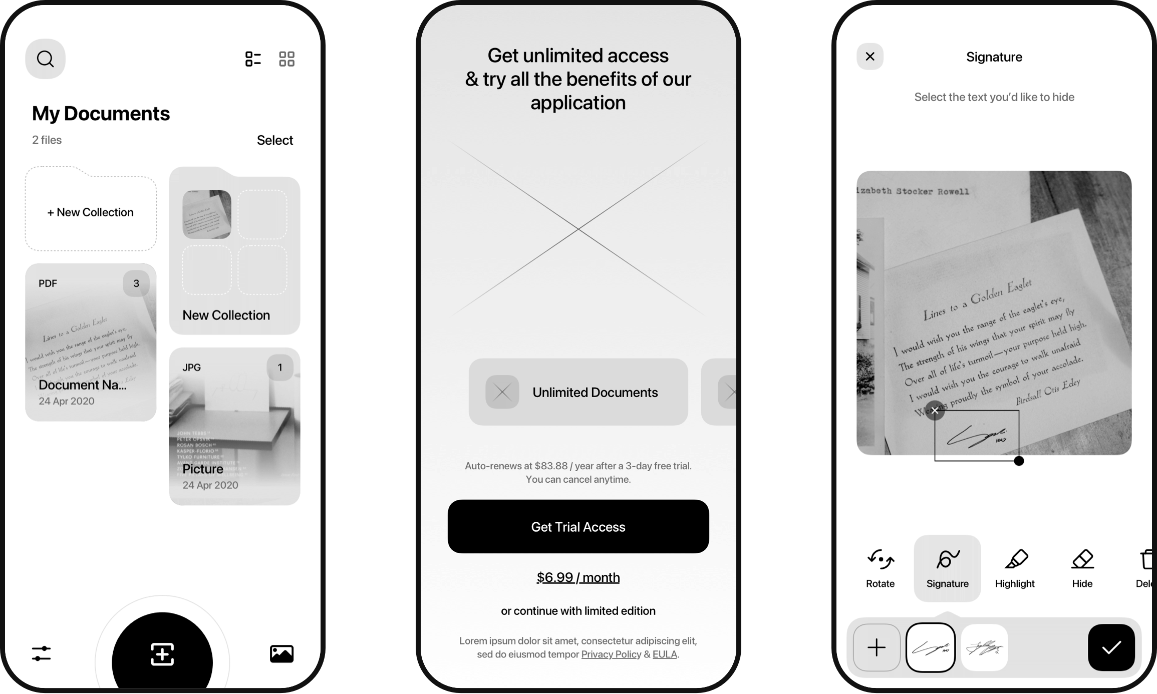
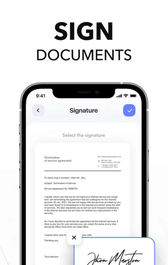
Sign your documents
Scanner+ can do much more than just scanning documents. For example, users can sign their scanned documents on the go and create a customized signature that can be used across documents. Flexible customization capabilities allow users to choose font and color, scale and rotate signatures.
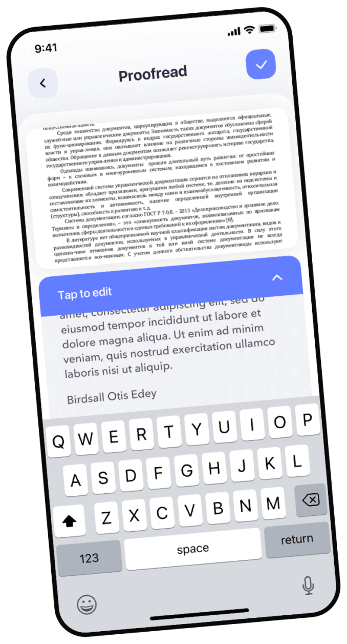
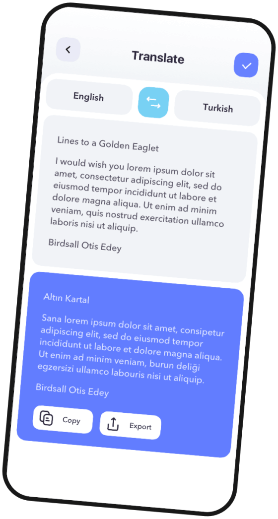
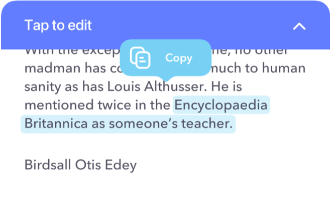
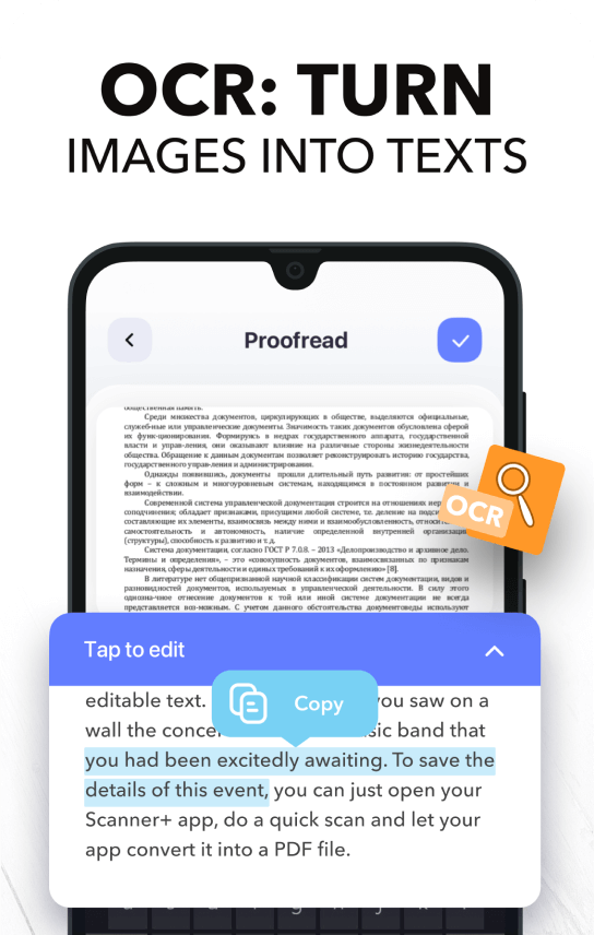
OCR: Convert images to text
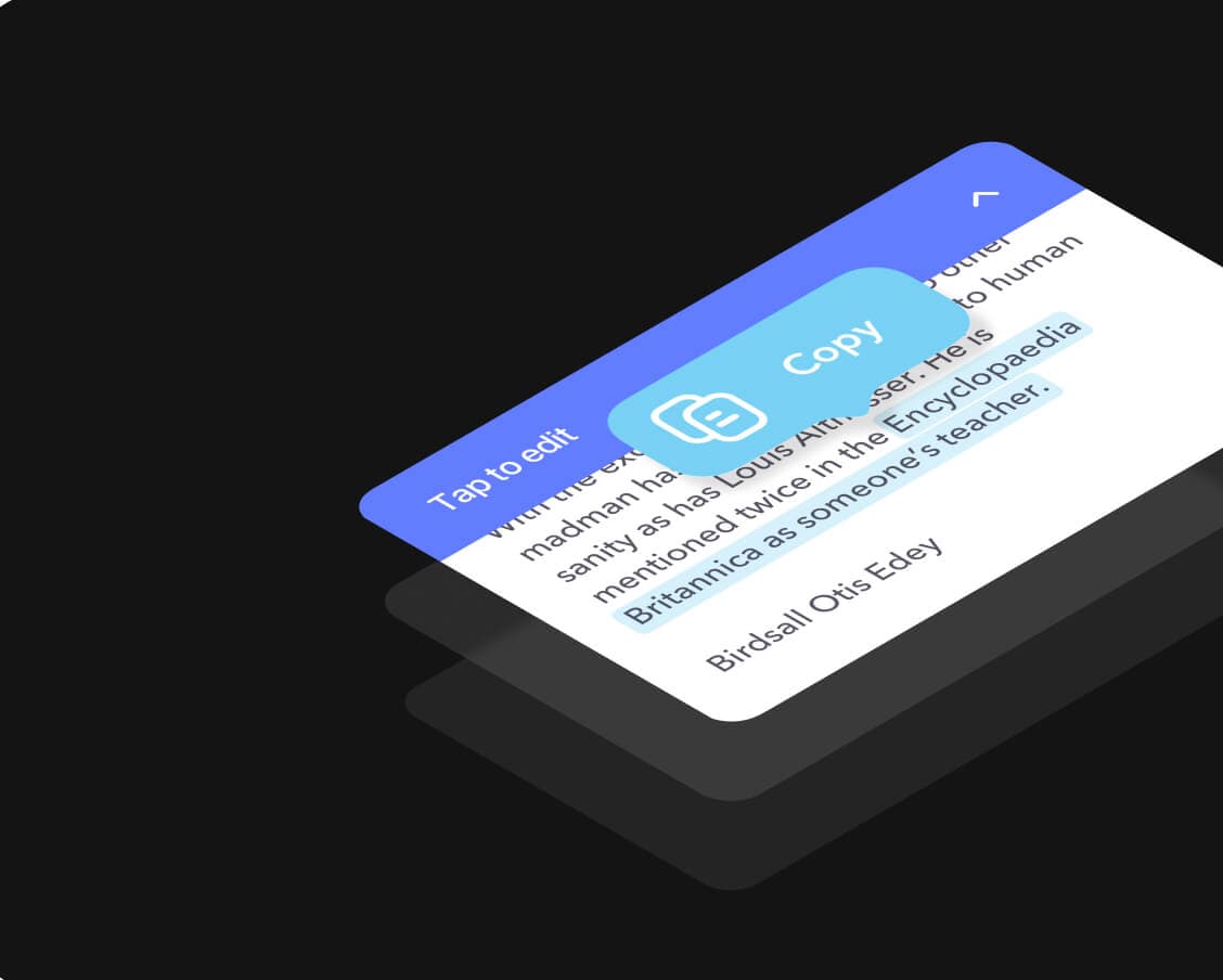
To further enhance the app's functionality, we added Optical Character Regonition (OCR) to locate text in an image and convert it to an editable text. All the user has to do is to simply take a picture, and the OCR technology will export the text, which can be edited, translated, saved as text document, and shared later.
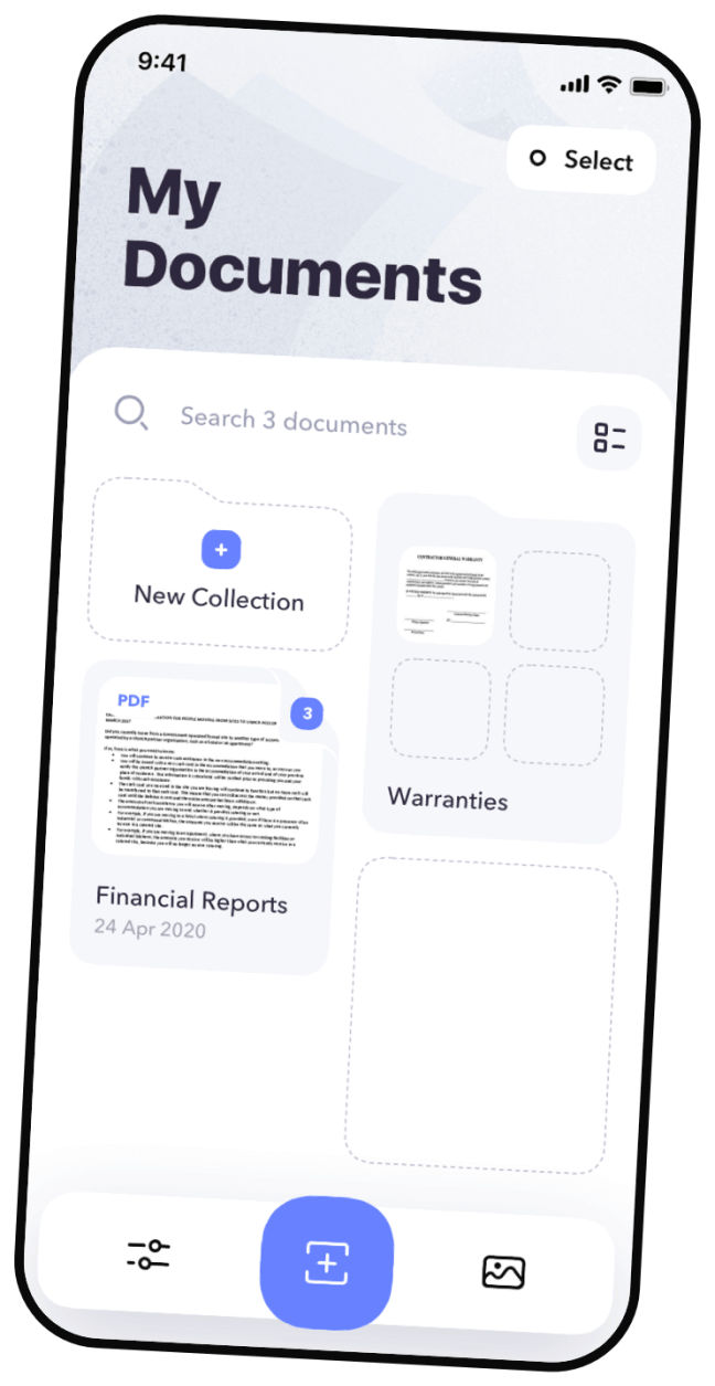
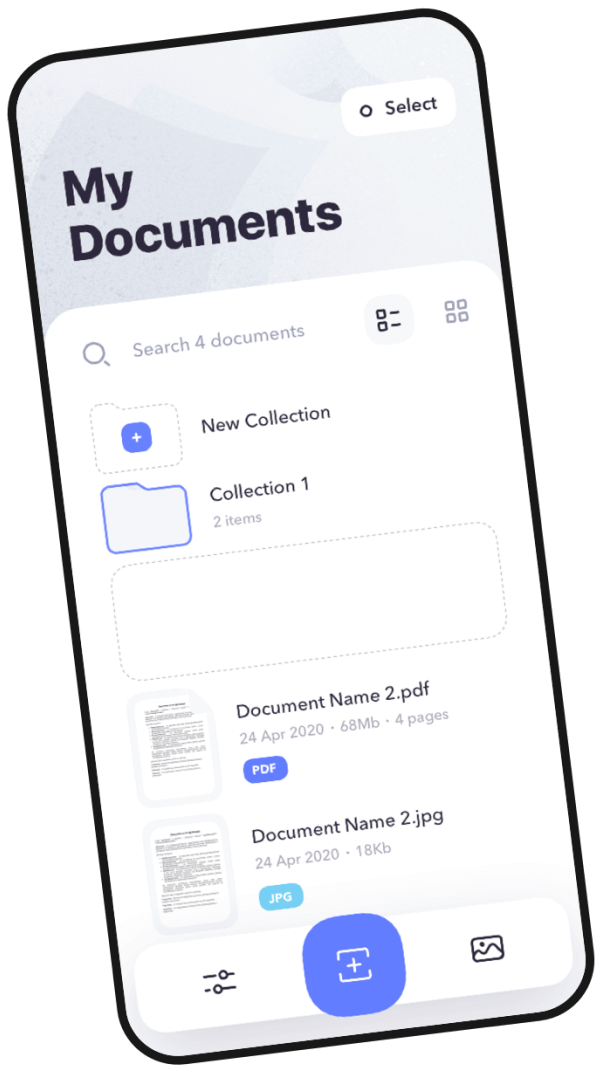
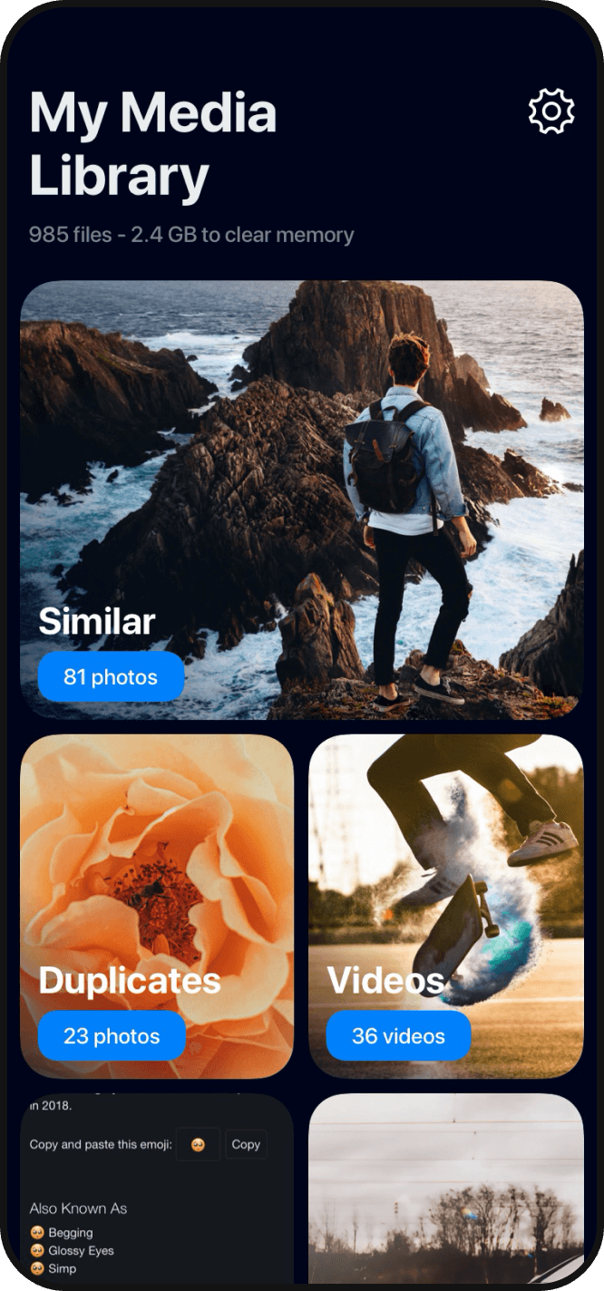
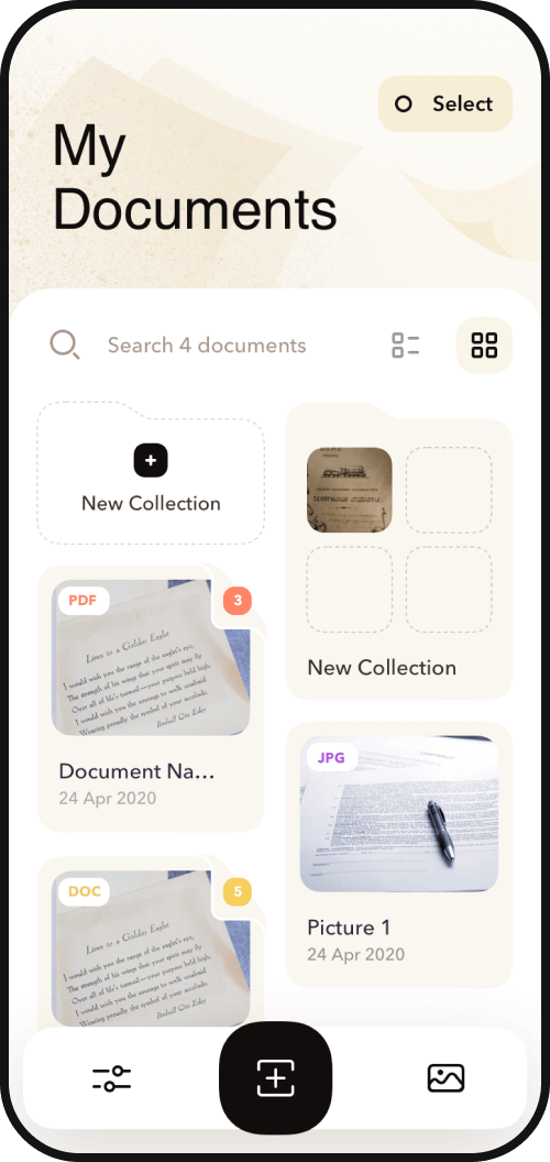
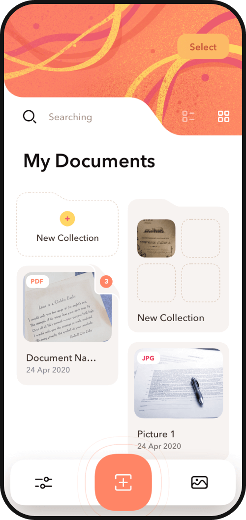
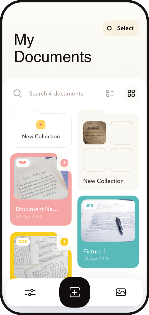
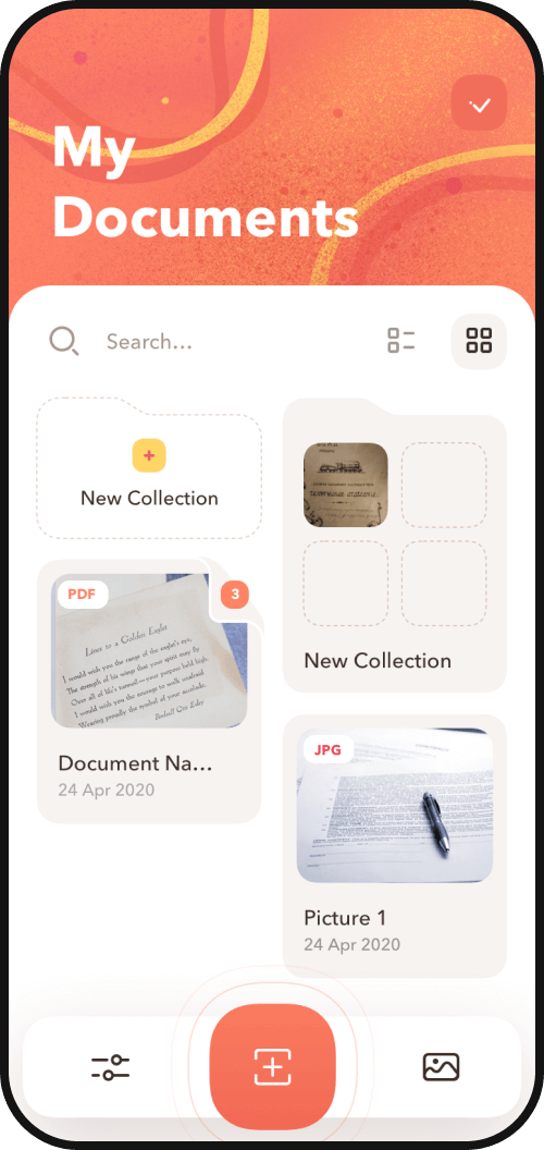
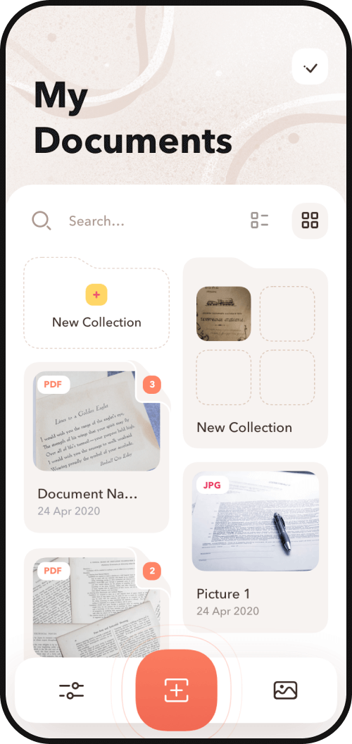
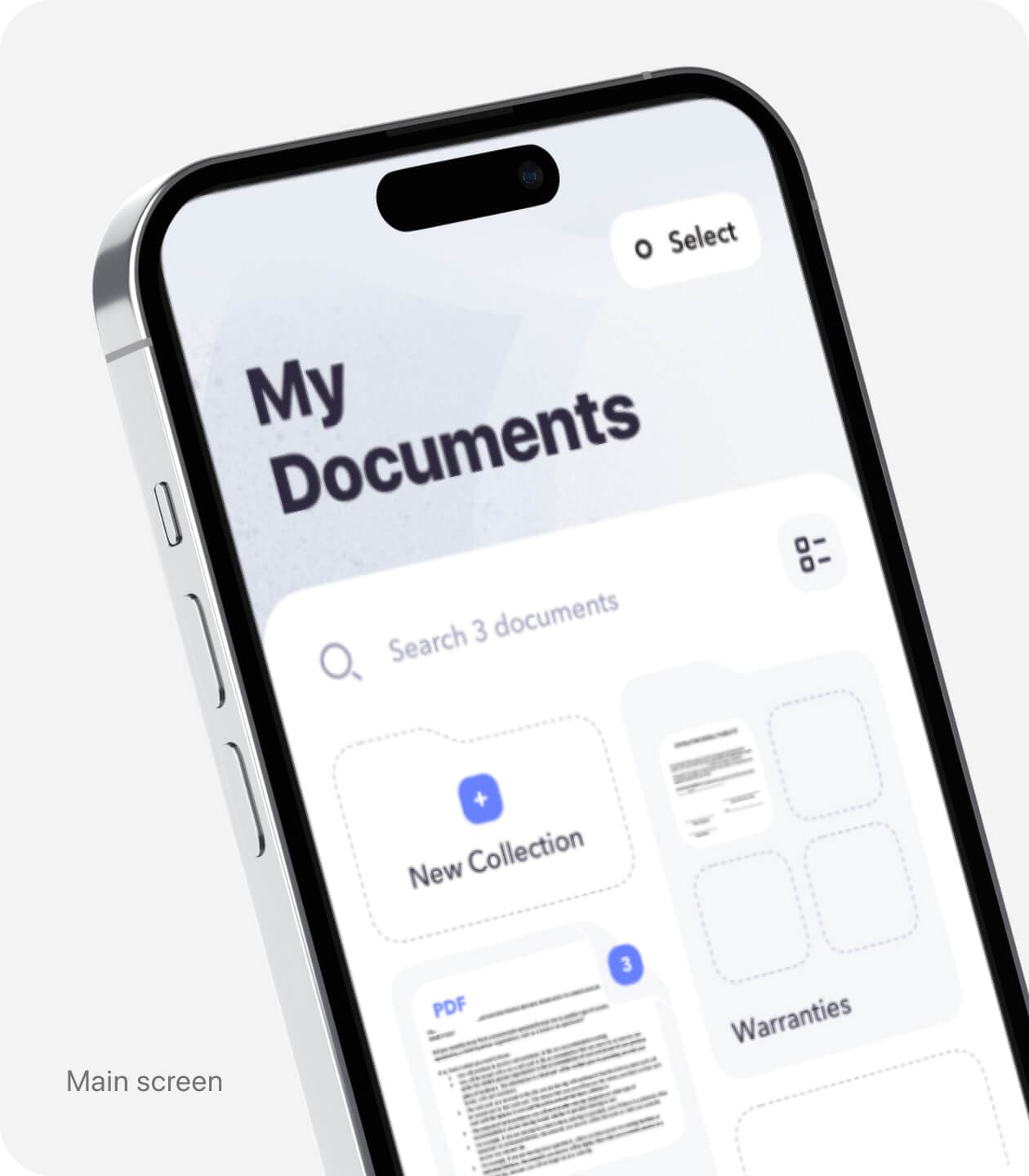
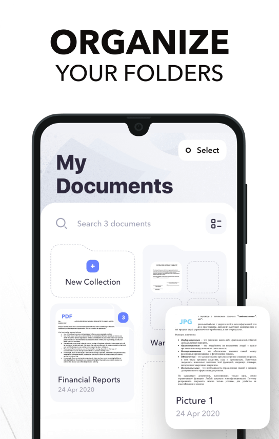
Stay organized
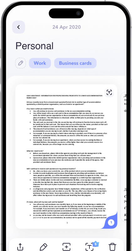
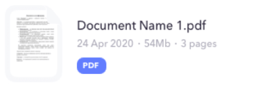
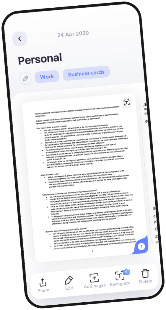
It was important to our client that the app users can easily locate scanned documents on their devices. Scanner+ is equipped with a drag and drop file manager that keeps documents organized. To make the search process more convenient, users can create folders to arrange theirs scans by topic and use smart name tags.
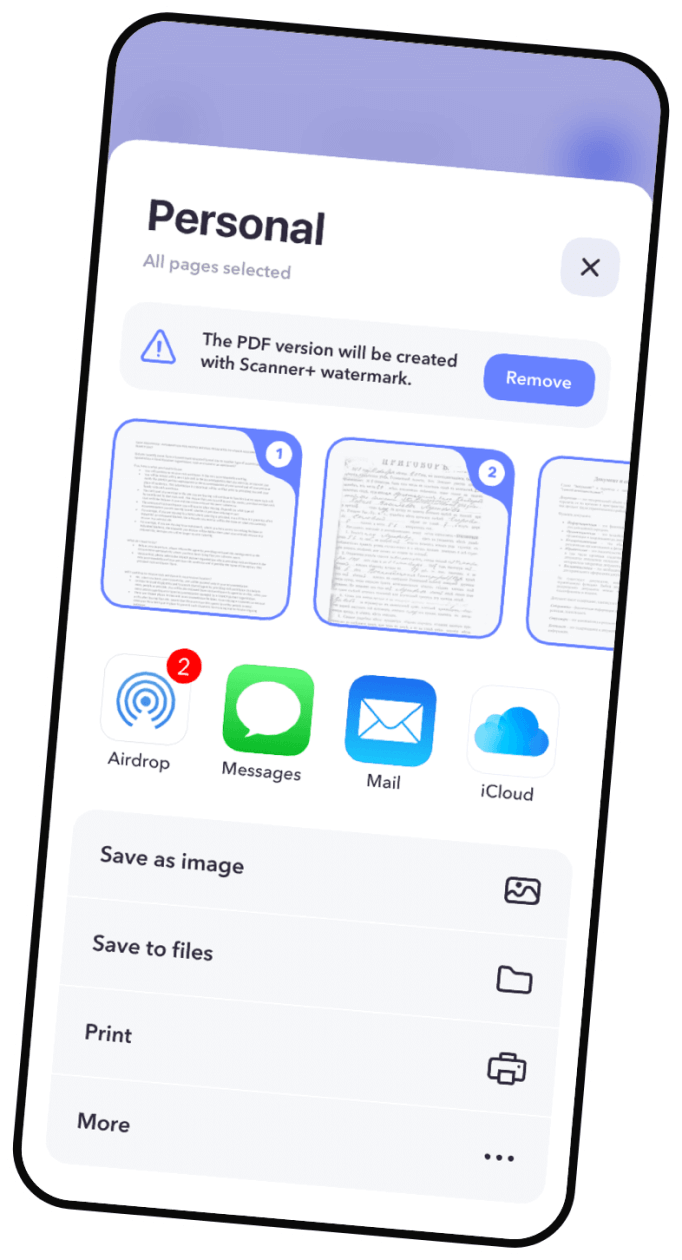

Share and Print
Another convenient feature of the app is the ability to share only a portion of the document. Users can select any number of pages they like and create a new document. The newly-created document can then be saved, shared, and printed.
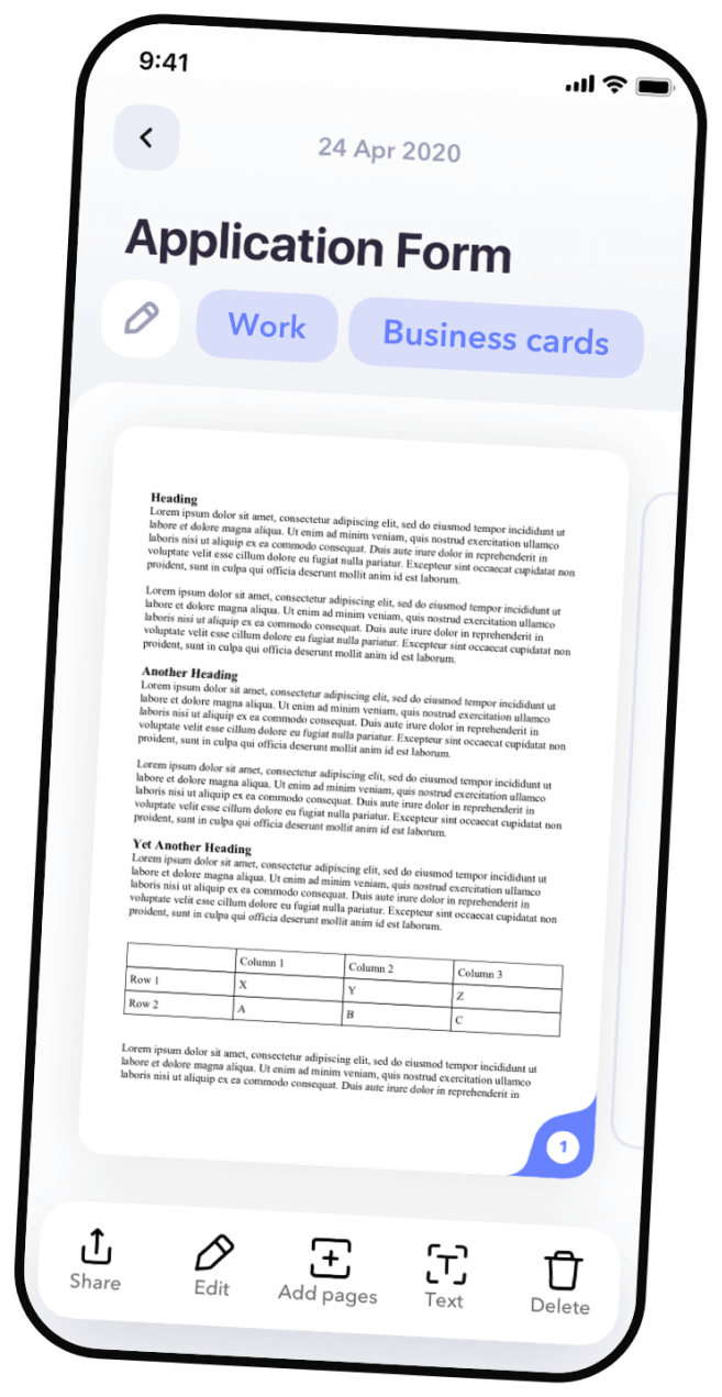
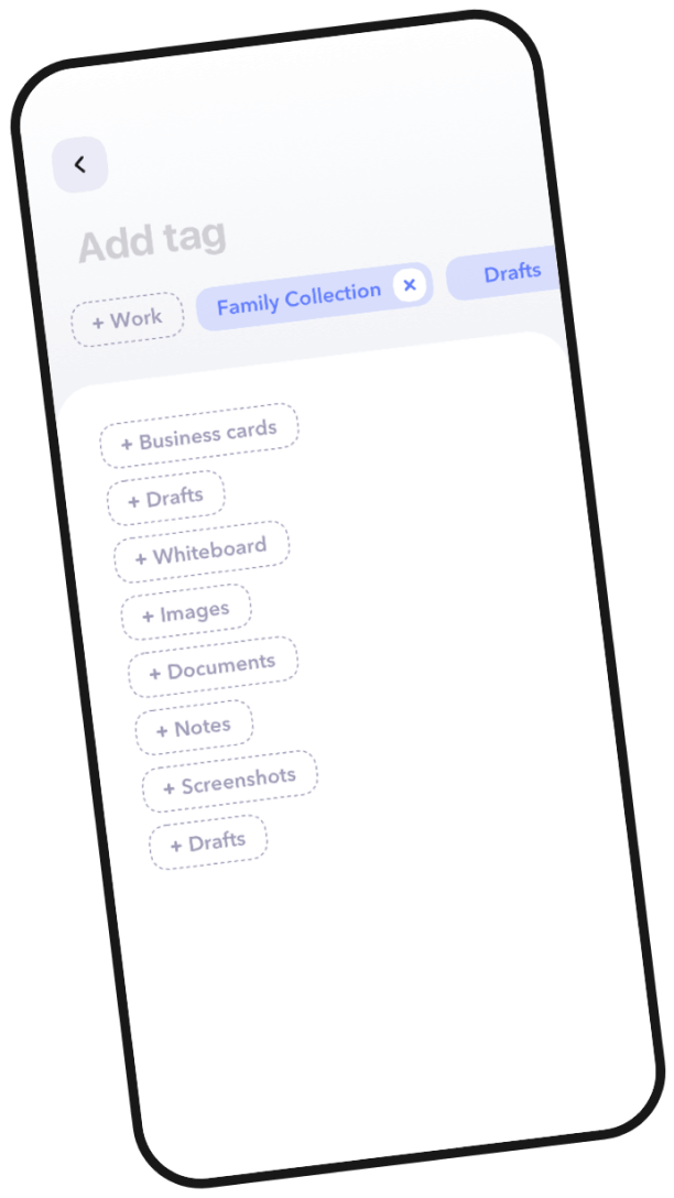
Use tags to categorize
Users can assign smart tags for their documents. With tags, it's easy to find documents on the same topic.
Design process
Research
Our team researched around 20 competitors, identified key issues with requested functionality and analyzed appropriate solutions. As a result, we were able to implement best case practices in UX design, while making sure that UI design is adequate to support them.
Design process
We created a sitemap that defined the structure of the app and ensured user flow. Based on user story mapping, our team tested possible user stories and made sure that there are no gaps and all user stories perform in an optimal way.
Design process
UX Wireframes
After finalizing the functionality, we produced several iterations of high-fidelity wireframes. It allowed us to craft a well thought-out user journey for every scenario.
We created clickable wireframes to simulate a prototype that is similar to the end product. We developed and carried out user testing for prototype validation. This helped us to test every hypthesis before proceeding to the development stage.
Design process
UI Design
Our team developed a unique design that is aestethically pleasing and emotionally appealing to the user. We used shades of blue and purple because these colors are optimal for prolonged screen time use. Smooth and fluid interface elements provided maximum comfort to the users, eliminated distrations, and helped to improve concentration.
Design Concept
The client provided us with the description of a user persona. We chose blue and purple color scheme to communicate business-mindedness, confidence, and trust of this dynamic group of professional users. We used orange as an accent color in illustrations to reflect users' creativity and drive.


Illustrations
Buidling an emotional connection with the user through visually appealing illustrations was an important aspect of the interface design. We carefully crafted illustrations and icons to communicate the full potential of the app during onboarding and provide additional context for specific features of the app.
Swipe to see more
To ensure seamless user experience, we added an option to swtich between tools with a swipe motion.
Switch between tools
Animations
Another unique and prominent feature of the interface design was animation. Animated onboarding and loading screens reflected dynamic lifestyle of the users and made their experience with the app more enjoyabe. In addition, animations helped our team to effectively communicate our design concept to the development team. This important communication step ensured that the user experience created by our team would be implemented by the client's team of developers with ease and precision.
Branding
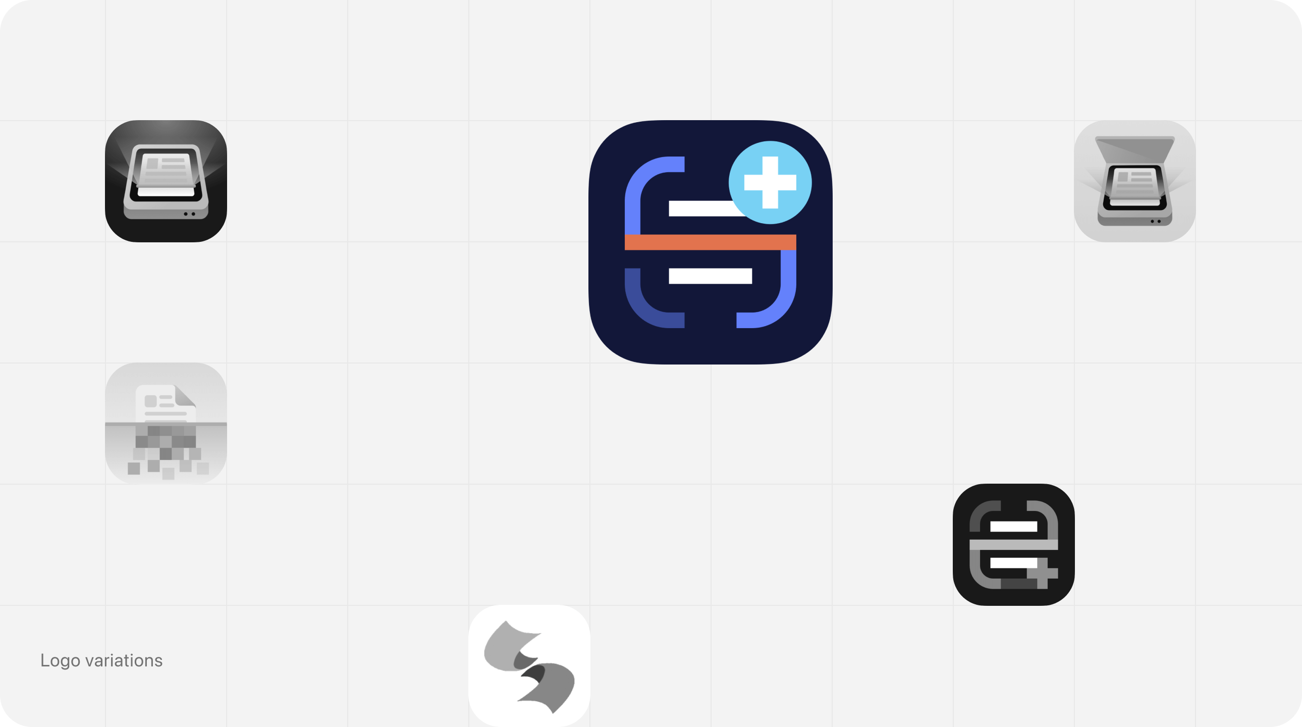
Logo
To create a unique app icon that would be easily recognizable by the users, we designed a wide range of iterations in different styles and selected the most distinctive one in the end.
Branding
Typography
Since Scanner+ is a multilingual app, we selected a standard IOS font that would look good across all languages.
SF Pro Display
RegularMediumSemiboldBold
AaBbCcDdEeFfGgHhIiJjKkLlMmNnOoPpQqRrSsTtUuVvWwXxYyZz
010203040506070809
Branding
Colors
We chose blue and purple color scheme to communicate business-mindedness, confidence, and trust to the diverse group of professionals, who would be using the app. Another benefit of these colors is that they are easy on the eyes and are optimal for prolonged screen time use. We used orange as an accent color in illustrations to reflect users' creativity and drive.
#6481FB
Blue Crayola
#78D1F4
Baby Blue
#E2734E
Burnt Sienna
Conclusion
We really enjoyed collaborating with our client at every stage of this project. Our shared passion for creativity, timely feedback, and impeccable attention to detail allowed us to produce a high-quality user-centered design.
.68243be7.png&w=640&q=75)
.33b53e31.png&w=640&q=75)
Cases